library(tidyverse)
library(sgsur)3 Exploratory data analysis
Every data analysis journey begins the same way: you are faced with a dataset that needs to be understood. Before we try to explain, predict, or test anything, the first and most natural step is simply to look and explore the data. That activity is called exploratory data analysis (EDA). Think of EDA as an informal “getting-to-know-you” conversation with the data. We are not yet fitting statistical models, conducting formal tests, or drawing conclusions; we are just describing and understanding what is there. We skim the numbers, summarise their main features, sketch quick plots, and reflect on what we see. Along the way, we ask questions like: What types of variables do we have? Where are their centres? How are they spread out and shaped? What relationships exist between variables?
The chapter covers
- Exploratory data analysis provides an essential first look at any dataset before formal modelling or hypothesis testing begins.
- Functions like
glimpse()andskim()quickly reveal variable types, ranges, missing values, and potential data quality issues. - Histograms and boxplots visualise the centre, spread, and shape of distributions, revealing patterns invisible in raw numbers.
- Measures of centre (mean, median, mode), spread (range, IQR, standard deviation), and shape (skewness, kurtosis) quantify distribution characteristics.
- Scatterplots with smoothing curves and correlation coefficients (Pearson, Spearman) reveal relationships between pairs of variables.
- Effective EDA habits include checking codebooks, confirming variable types, noting outliers and missing values, and documenting observations for later analysis.
3.1 Datasets in R
As with most chapters in this book, we will use two packages, tidyverse and sgsur, and so the first step is to load them:
The dataset we will use in this chapter is whr2025, which is built into sgsur. It provides data from the World Happiness Report 2025. For each of 139 countries, the principal variables we have are happiness, a measure of average life satisfaction, and gdp, the gross domestic product (GDP) per person in 2021 international dollars. The lgdp is the base 10 logarithm (see Note 3.2) of gdp, and income divides the countries into three equally sized groups on the basis of their gdp value.
Note 3.1: Anatomy of a dataset
When working with data, it helps to have a shared language for what we mean by “variable” or “observation.”
- Data
- Recorded values about things in the world (people, places, events), usually measured or classified consistently.
- Dataset
- A collection of data, often organised as a rectangular table.
- Observation (row, case, record)
- One unit you’re studying. Examples: one person, one country, one school.
- Variable (column, field, feature)
-
An attribute measured on each observation. Examples:
age,happiness,gdp. - Value
- The specific entry in a cell where a row and column meet.
- Data frame (R)
-
R’s rectangular data structure (rows = observations, columns = variables). A
tibbleis a modern data frame that prints nicely and keeps types stable. - Identifier (ID, key)
-
A column (or columns) that uniquely identifies each row (e.g.,
person_idorcountry+year). - Terminology equivalents
- Row ≈ observation ≈ case; Column ≈ variable ≈ field; Outcome ≈ response ≈ dependent variable; Predictor ≈ explanatory ≈ independent variable.
- Tidy data
- Each variable is a column, each observation is a row, each cell holds one value.
Note 3.2: What is a logarithm?
A logarithm is the opposite of an exponent. When \(2^3 = 8\), the logarithm asks: “What power gives 8?” Answer: \(\log_2(8) = 3\). The small number after “log” is the base. Similarly, \(\log_{10}(1000) = 3\) because \(10^3 = 1000\). When no base is written, it is usually 10 (common logarithm) or \(e \approx 2.718\) (natural logarithm, written \(\ln\)).
Logarithms are used throughout statistics because they turn multiplication into addition, keep numbers manageable for computers, and arise naturally in formulas involving probabilities and exponential relationships.
3.2 Looking, glimpsing, skimming
Once we have our dataset in R, the very first thing to do is to simply look at it.
The whr2025 is built into the sgsur package that we have loaded, so all we have to do is type its name:
whr2025# A tibble: 139 × 6
country iso3c happiness gdp lgdp income
<chr> <chr> <dbl> <dbl> <dbl> <ord>
1 Afghanistan AFG 1.72 1992. 3.30 low
2 Albania ALB 5.30 18244. 4.26 medium
3 Algeria DZA 5.36 15159. 4.18 medium
4 Argentina ARG 6.19 27105. 4.43 medium
5 Armenia ARM 5.46 19230. 4.28 medium
6 Australia AUS 7.06 59553. 4.77 high
7 Austria AUT 6.90 65015. 4.81 high
8 Azerbaijan AZE 4.89 21262. 4.33 medium
9 Bahrain BHR 5.96 57213. 4.76 high
10 Bangladesh BGD 3.89 8242. 3.92 low
# ℹ 129 more rowsThis is a simple act, but it is very informative.
We see from the top line that the dataset is a tibble or data frame (see Note 2.3) with 139 rows and 6 columns.
Next we see the column names:
country,iso3c,happiness, …,income. For some or many of these, it is obvious or we can guess what the variables mean. For example, it is obvious on the basis of the name and also by seeing values likeAfghanistan,Albania,Algeria, …,Zimbabwethatcountryrepresents countries. Most R packages, includingsgsur, provide documentation for the packaged datasets, so doing?whr2025opens a complete description of this data in your Help pane that details what each variable means and where the data came from. Unfortunately, however, it will not always be this clear and easy, see Note 3.3.Next we see the R data types of the variables:
<chr>,<chr>,<dbl>, …,<ord>. These somewhat cryptic labels are very important. There are many tags in general, but the most common ones are:<chr>Sequences of characters or text, anything written inside quotation marks, such as"Australia"or"blue".<dbl>Numeric values that can include decimals (or whole numbers written as decimals), e.g.3.14or42.0.<int>Whole numbers (integers), e.g.42or-7.<lgl>Logical values (Boolean values):TRUE,FALSE.<fct>Categorical values stored as named levels with no built-in order (e.g. hair colours"brown","blonde","red").<ord>Categorical values whose levels have a defined order, so comparisons like"low" < "medium" < "high"make sense.<date>Calendar dates printed asYYYY-MM-DD, e.g.2025-07-03.<dttm>Full date-time stamps printed asYYYY-MM-DD HH:MM:SS, e.g.2025-07-07 13:45:02.<time>Durations or time intervals, printed as a number plus units, e.g.3.2 secs.
How R’s data types relate to statistical data types is something we discuss in Section 3.3.
Next we see the top ten rows of the data frame. Even casually looking over the values we see is often very informative. For example, we can guess that the
happinessvariable is probably on a scale from around 1 to around 8 (in fact, it is from 0 to 10), or thatgdprepresents average income per person in dollars (rather than thousands of dollars), or thatincomehas three levelslow<medium<high, and so on. If we want to see more rows, we can use theprintfunction and usento indicate the number of rows. For example, to see 20 rows, do this:print(whr2025, n=20)
Note 3.3: What do my variables mean?
Seeing the column names in a data frame is often helpful but seldom enough. A name like country is easy to decode when the entries read “Australia”, “France”, and so on, yet others (score, cond, A_RGENB, V5) can be quite opaque. Is score a percentage, a 1–10 scale, or something else entirely? And a score of what exactly? To answer questions like these, we require a codebook (sometimes called a data dictionary or README) that spells out each variable’s meaning, units, and provenance. In very well maintained datasets, these will be provided, but data you find somewhere on the web may have nothing more than cryptic column labels. In those cases, you can spend hours piecing together definitions, or even find the data unusable because key details are missing. Column names, then, are a starting clue, not a guarantee: always track down or create a proper codebook before moving beyond a cursory look.
Typing the name of your data frame and scanning the printed preview is something you should always do. It takes seconds to do but always tells you important things. The default view, however, shows only as many columns as can fit across your screen. If your dataset has dozens or hundreds of variables, the remaining columns that cannot easily fit on screen are summarised in a single trailing line such as “and 57 more variables”, leaving most of your data hidden from view. When you need a fuller but still compact overview, use glimpse(), which is part of dplyr (and so loaded if you load tidyverse).
glimpse(whr2025)Rows: 139
Columns: 6
$ country <chr> "Afghanistan", "Albania", "Algeria", "Argentina", "Armenia",…
$ iso3c <chr> "AFG", "ALB", "DZA", "ARG", "ARM", "AUS", "AUT", "AZE", "BHR…
$ happiness <dbl> 1.721, 5.304, 5.364, 6.188, 5.455, 7.057, 6.905, 4.893, 5.95…
$ gdp <dbl> 1992.424, 18244.293, 15159.324, 27104.980, 19230.190, 59552.…
$ lgdp <dbl> 3.299382, 4.261127, 4.180680, 4.433049, 4.283984, 4.774903, …
$ income <ord> low, medium, medium, medium, medium, high, high, medium, hig…As you can see, glimpse() rotates the display so columns become rows, listing every variable with its type tag and a sample of values. Because the output is vertical and terse, you can scroll through wide datasets without losing track of what each column contains, all within the same pane of your console or RStudio window.
After you have examined your data frame by typing its name and then using glimpse(), always complete your initial exploration with the skim() function to get some summary statistics and identify potential data quality issues. The skim() function is part of the skimr package, but it is bundled with sgsur so you do not need to load another package.
skim(whr2025)── Data Summary ────────────────────────
Values
Name whr2025
Number of rows 139
Number of columns 6
_______________________
Column type frequency:
character 2
factor 1
numeric 3
________________________
Group variables None
── Variable type: character ────────────────────────────────────────────────────────────────────────────────────────────
skim_variable n_missing complete_rate min max empty n_unique whitespace
1 country 0 1 4 28 0 139 0
2 iso3c 0 1 3 8 0 139 0
── Variable type: factor ───────────────────────────────────────────────────────────────────────────────────────────────
skim_variable n_missing complete_rate ordered n_unique top_counts
1 income 0 1 TRUE 3 low: 47, med: 46, hig: 46
── Variable type: numeric ──────────────────────────────────────────────────────────────────────────────────────────────
skim_variable n_missing complete_rate mean sd p0 p25 p50 p75 p100 hist
1 happiness 0 1 5.55 1.15 1.72 4.81 5.82 6.42 7.74 ▁▂▆▇▅
2 gdp 0 1 27385. 26279. 1456. 6477. 18244. 43428. 132847. ▇▂▂▁▁
3 lgdp 0 1 4.20 0.499 3.16 3.81 4.26 4.64 5.12 ▃▅▇▇▅As you can see, skim() runs a comprehensive diagnostic sweep over every column and prints a well-formatted text report that fits neatly in the console. At the top, you learn how many rows and columns the dataset contains and what types of variables (text, numbers, categories) are present. Then each block provides variable-by-variable details: how many entries are missing, how many distinct values exist, and key summary statistics (we will cover these in detail in Section 3.5).
Even apart from the summary statistics that we will gloss over right now, skim() provides a more complete picture of your data than basic inspection alone. For example, it can reveal problems such as columns filled with missing data (n_missing is the number of missing values; complete_rate is the proportion of non-missing values), and tells you more about each variable, such as that the income variable is an ordered factor with three distinct values (n_unique = 3), and country has 139 distinct values.
3.3 Data types
Before we go further, let us discuss the important concept of data types in statistics. In statistics, the variables we deal with can be of different types, and recognising these differences is essential for choosing the appropriate analysis. There are different classification systems for data types, but the following are the most widely used types.
- Continuous
- A continuous variable is a numeric variable that can, in principle, take on any value within a given range, not just whole numbers. For instance, the daily temperature in a city might normally range from -5°C to 35°C, and within that range it could take on values like 12°C, 18.6°C, or 22.137°C depending on the precision of the measurement. Continuous data can include both positive and negative values, depending on what is being measured. Common examples of continuous variables include weight, height, temperature, and time.
- Categorical
- A categorical variable represents data where there are a finite number of discrete categories that do not have any particular order, that is, one group is not higher or better than another. Examples include marital status, nationality and hair colour. A variable that contains only two response options, e.g., yes/no, is often called a binary or dichotomous variable. A binary variable whose two values are TRUE and FALSE is sometimes known as a logical or Boolean variable.
- Count
- A count variable is a count or tally of the number of times something has happened or taken place. Count data is similar to continuous data in that it is numeric; however, it differs since values can only take on non-negative integers, e.g., 0, 1, 2. Counts start at 0 and can be unbounded, i.e., have no upper limit, or bounded, i.e., have an upper limit. Examples of count data are the number of doctor visits per year a person makes, the number of children someone has, or the number of times the heart beats in a 10-second interval.
- Ordinal
- An ordinal variable is similar to categorical data in that there are a finite number of discrete categories. However, the categories in ordinal data have an order. For example, educational attainment has an order: postgraduate is a higher level of education than undergraduate, which is higher than high school. Another characteristic of ordinal data is that the distance between the categories may not be equal. For example, language ability might be measured as beginner, intermediate and fluent, but it is not immediately clear how close beginner and intermediate speakers are, or how much more of a language a fluent speaker can understand as compared to an intermediate speaker. Ordinal data are used extensively in social science research and are often encountered in the form of agreement scales, i.e., 1 (strongly disagree) to 5 (strongly agree), and hence are often recorded as numbers. Since ordinal data is often represented numerically, this frequently leads to it being erroneously treated and modelled as a continuous measurement.
R’s data types (character, numeric, factor, logical) describe how the computer stores and handles the data, while statistical data types (continuous, ordinal, categorical, count) describe the mathematical and analytical properties of what the data represents.
Here are some mismatches between them:
- Numeric can represent different statistical types: A numeric variable might be continuous (height), count (number of children), ordinal (1 = disagree, 2 = neutral, 3 = agree), binary categorical (0 = no, 1 = yes), etc.
- Characters can be various types: Text like “high”, “medium”, “low” represents ordinal data, while “red”, “blue”, “green” represents categorical data.
- Categorical variables are not always factors: An unordered factor does represent categorical data, but so too can a character variable.
- Logical variables are a type of categorical variable, but have their own R type.
Just because R stores your survey responses as numeric (1, 2, 3, 4, 5) does not mean you should treat them as continuous data and calculate means. The statistical nature of your data should guide your analysis choices, not just the R data type. Always think about what your data actually represents, not just how R is storing it. The statistical type determines which analyses are appropriate, while the R data type determines which functions will work.
3.4 Visualising distributions
As we now know, the whr2025 dataset records each nation’s average life satisfaction score on a 0–10 scale, along with economic indicators such as GDP per person. Before we compare richer and poorer nations in terms of their average happiness, or examine the relationship between a nation’s income and happiness levels, we need a clearer picture of how happiness and income values are distributed across countries. One of the most effective ways of doing this is to plot the data. While there are many visualisation options, two of the most widely used tools for exploring distributions are histograms and boxplots.
With both of these tools, we want to use them to get a sense of the following characteristics of the distribution:
- centre: what is a typical value, or the middle of the distribution, or the point around which the data cluster.
- spread: the degree to which the data deviate from that centre.
- shape: other properties like the asymmetry in the distribution, the balance of mass in the tails versus the centre, or number of peaks the distribution has (modality).
R offers powerful visualisation tools, chief among them the ggplot2 package in the tidyverse. For brand-new users, however, ggplot2’s code can feel like being thrown in at the deep end, even though plotting should be one of the very first skills you acquire. To bridge that gap, the sgsur package provides lightweight wrapper functions — histogram(), tukeyboxplot(), and scatterplot() — that build ggplot2 graphs with a single line of code; the complexity stays under the hood while you get the picture.
3.4.1 Histograms
To make a histogram of the distribution of happiness, we can use the histogram() command from the sgsur package:
histogram(happiness, data = whr2025)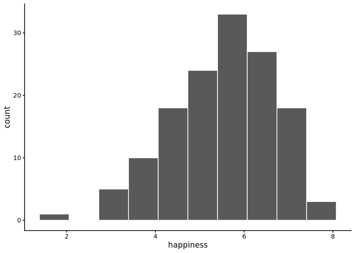
As you can see, all we need to do here is first specify the variable we want to plot, happiness, and then the name of the data frame that contains that variable, whr2025.
A histogram works by dividing the range of your data into intervals (called “bins”) and counting how many data points fall into each interval. By default, histogram() uses 10 bins, but we can change this. Here is how it works step-by-step using happiness from whr2025 with 10 bins:
- Find the data range. Determine the minimum and maximum values in the
happinessvariable. The happiness scores range from 1.72 to 7.74. - Create the bins. Divide this range into 10 equal-width intervals. The total range is 6.02 (7.74 - 1.72), so each bin has a width of 0.602. For example, Bin 1 is from 1.72 to 2.322, Bin 2 is from 2.322 to 2.924, and so on.
- Count the data points. Go through each country’s happiness score and determine which bin it belongs to. A country with a happiness score of 2.8 goes in Bin 2, a score of 5.2 goes in Bin 6, etc.
- Create the visual representation. Draw a bar for each bin where the height represents how many countries fall in that bin and the width represents the bin interval. In principle, the bars are placed adjacent to each other with no gaps. In practice,
ggplot2’s default style shows narrow white lines between bars, and if a bin has zero counts it appears as a gap.
The result is a shape that shows the distribution of happiness scores, revealing patterns like whether most countries cluster around certain values, whether the distribution is symmetric or skewed, and whether there are any outliers.
We can change the number of bins used by the bins argument. By default, bins = 10, but we can set this value to any other positive whole number. The number of bins to use is always a matter of choice; there is no correct answer. If we use too few bins, the histogram may be too coarse and we will miss details. On the other hand, too many bins and the histogram becomes too granular, creating a jagged appearance that obscures the overall pattern. Choosing the right number of bins is ultimately a trade-off between being too coarse (missing important details) and being too noisy (obscuring the overall pattern). The best approach is to experiment with different values and see which one reveals the distribution most clearly. With larger datasets containing thousands or millions of observations, you can typically use many more bins without creating excessive noise, since each bin will still contain enough data points to be meaningful.
In the case of happiness, around 20 bins provides a good balance:
histogram(happiness, bins=20, data = whr2025)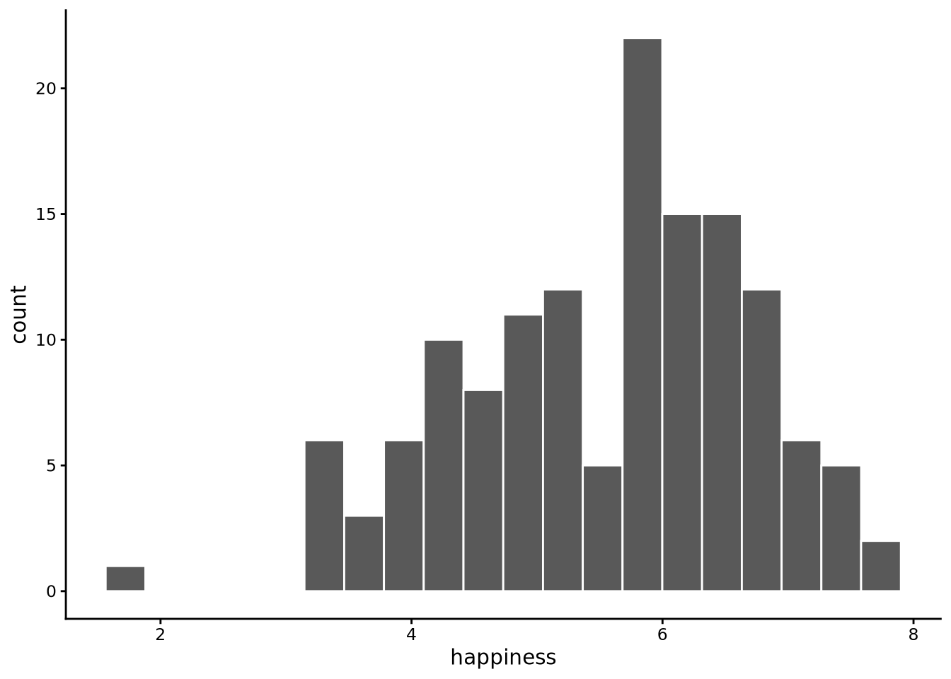
Examining this plot, we can see that the distribution is centred approximately around 6, has one peak, is relatively spread out with values ranging from around 2 to around 8, and is not perfectly symmetrical, with a longer tail to the left, but there are no very extreme values.
Note 3.4: What are tails?
The tails of a distribution are the stretched-out ends where the rarer values live. They show how far the data extend away from the main cluster in the centre. A long tail means a few observations lie far from the bulk, while a short tail means almost all values are packed close to the centre. Even when tails are long, they often contain only a thin scattering of observations.
For comparison with happiness, let’s now look at the distribution of the gdp variable.
histogram(gdp, bins=20, data = whr2025)
In this case, we see that the distribution is centred somewhere around $25,000 with a relatively long tail to the right. This means that while many countries have relatively low incomes, an increasingly small number have increasingly high incomes. A relatively sizeable minority have incomes at or around $50,000, but the tail stretches as high as to over $100,000.
3.4.2 Boxplots
Boxplots, or more properly called box-and-whisker plots, are an alternative means to plot distributions. There are a few different versions, but the main or standard version is due to the famous statistician John Tukey, and so they are sometimes called Tukey boxplots. In sgsur, the boxplot is implemented with tukeyboxplot().
To visualise the distribution of happiness with a boxplot, use the following command:
tukeyboxplot(happiness, data = whr2025)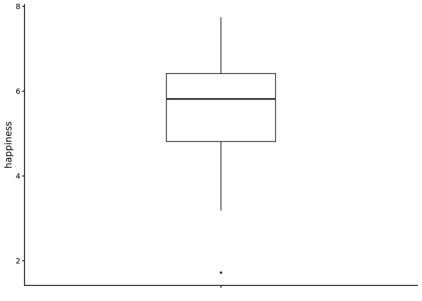
Note that if you prefer a horizontal orientation, you can flip the axes using coord_flip() from the ggplot2 package.
A Tukey boxplot summarises a distribution with five key numbers and a handful of points. It is calculated as follows:
- Order the data. Sort every value up from smallest to largest.
- Calculate the first, second, and third quartile. We will discuss these in more detail below, but the first quartile (Q1) is the point below which lies 25% of the data (and so 75% of the data is above it). The second quartile (Q2), also known as the median, is the point below which lies 50% of the data (and so 50% is above Q2 too). The third quartile (Q3) is the point above which lies 25% of the data (and so 75% of the data is below it). These Q1, Q2, and Q3 define the box. The lower (or left) edge is Q1, the upper (or right) edge is Q3, and the midline is Q2.
- Measure the IQR. The inter-quartile range (IQR) is the distance from Q1 to Q3. It tells you how wide that middle half is.
- Draw the whiskers. From each end of the box, extend a line out to the most extreme value that is still within 1.5 × IQR of the box edge.
- Flag any outliers. Values beyond the whiskers get their own dots. They are not “errors”; they are simply noticeably higher or lower than most of the data.
Because the boxplot is built on ordered positions (a quarter of the way, halfway, etc.), you can read three things at a glance:
- where the bulk of the values lie (the box),
- how far typical values stray from the centre (the length of the box and whiskers),
- and whether the distribution leans or stretches more on one side (the median not centred in the box; unequal whiskers; many outlier dots on one end).
Looking at the boxplot for happiness, we see the box’s middle bar, signifying Q2 or the median, sits a bit below 6, so we can tell that the typical country reports a life satisfaction score slightly above the mid-scale point (the original scale is from 0 to 10). The box spans roughly 5 to 7, meaning half of all countries fall inside that two-point window while around one quarter of the countries are below 5, and around one quarter are above 7. The lower/left whisker is a bit longer than the right, and a dot appears down near 2: a sign that the lower end stretches out farther than the upper one, which is exactly the left-tail we noticed in the histogram. No dots sit beyond the upper whisker, so extremely high scores are rare.
Let’s now turn to the boxplot for gdp:
tukeyboxplot(gdp, data = whr2025) + coord_flip()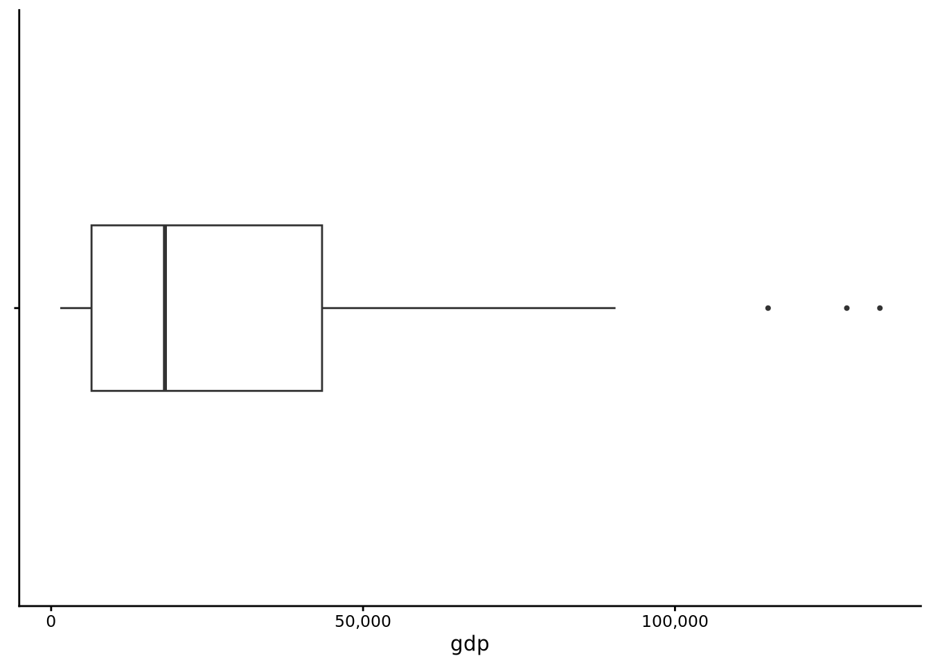
Here the picture changes considerably. The median is somewhere around $20,000, yet the upper whisker runs far to the right and a string of outlier dots climbs even higher. Most countries cluster in a comparatively narrow box on the low-income side, but a handful reach well past $60k. In other words, half of all countries are at or below around $20,000, and the other half are stretched out between $20,000 and well over $100,000. This confirms the long upper tail we saw in the GDP histogram: a small group of very wealthy nations pulls the upper tail far from the centre, while very low GDP values are rare enough not to appear as separate outliers on the left.
The Tukey boxplot is a simple plot. It could even be sketched by hand after a few calculations, but it is highly informative. It packs the centre, spread, and shape (asymmetry, tails) into a single compact graphic. In one glance we learned that happiness scores are fairly symmetric with a mild left tail, whereas GDP is highly asymmetric to the right and dotted with extreme high earners. Those impressions will guide the numeric summaries we develop in Section 3.5.
3.5 Descriptive statistics
The histograms and boxplots you have just drawn are not mere decoration; they already told us a great deal. At a glance we could see where most countries sit on the happiness scale, how tightly (or loosely) those scores bunch together, and whether the distribution leans to one side or sprouts a long tail. Visuals excel at revealing patterns quickly and at alerting us to oddities; an unexpected cluster, an outlying dot, a lopsided tail. Yet pictures alone cannot answer every practical question. If we want to precisely compare two datasets, report the major features of a distribution in a compact form, we also need numbers.
Descriptive statistics, often called summary statistics, do that numerical condensing. Just as our plots highlighted three visual cues, the numbers we compute will home in on three parallel facets:
- central tendency: the point around which the data cluster;
- spread or variability: how far observations stray from that centre;
- shape: everything else, particularly asymmetry (skewness) and the weight of the tails versus the middle (kurtosis)
The goal is the same: capture the most salient features of a variable, this time in a handful of well-chosen values.
3.5.1 Central Tendency
We will first focus on three measures of central tendency: the mean, the median and the mode.
3.5.1.1 Mean
When most people say “average,” they in fact mean the mean (or arithmetic mean, to be even more precise). The mean is calculated as the sum of all values divided by the number of values. Intuitively, the mean is the centre of gravity of the distribution of points. But this is not merely an analogy; the mean is literally the centre of gravity of the data.
Imagine each observation as a small, equal-weight bead on a long stick or ruler. Lay the ruler on a pivot, the fulcrum, and move that fulcrum left or right until the ruler balances and sits level. The spot where it balances is exactly the mean. Mathematically, the distances of beads to the left of the mean exactly counterbalance the distances of beads to the right. If you shift a single bead farther out in one direction, you must move the fulcrum toward it to keep everything level.
Let’s calculate the mean with R. For this, we will use the summarise() function that is part of dplyr, and so loaded if the tidyverse is loaded. As we will see, the summarise() function is a general-purpose tool for calculating any descriptive statistics. In the following line, inside summarise, we use mean(), which is R’s function for calculating the mean, to calculate the mean of happiness:
summarise(whr2025, mean_happiness = mean(happiness))# A tibble: 1 × 1
mean_happiness
<dbl>
1 5.55The output as you can see is a data frame (another tibble) with just one row and one column named mean_happiness. If we wanted to name that column differently, we could easily do so, for example:
summarise(whr2025, average_happiness = mean(happiness))# A tibble: 1 × 1
average_happiness
<dbl>
1 5.55The histograms and boxplots we drew earlier make the meaning of the mean more concrete. In the happiness histogram, most bars sit close to the middle of the scale, so the balance point lands near 6; a few countries down around 2 tug the mean leftward, but not by much because they are relatively light ballast compared with the many mid-range bars.
For comparison, let’s look at gdp.
summarise(whr2025, mean_gdp = mean(gdp))# A tibble: 1 × 1
mean_gdp
<dbl>
1 27385.Notice how this mean value of $27385 is noticeably higher than the midpoint of the box in the boxplot for gdp. For gdp, there is a huge stack of countries with modest incomes and a long tail of very high incomes. Those high-income countries act like beads fixed far out on the right side of the ruler, forcing the mean well beyond the bulk of the data.
As an aside, notice how the mean of gdp is displayed as 27385. without any digits shown in the decimal part of the value. This is the default behaviour of tibbles to show decimal digits to a set number of significant figures rather than decimal places (see Note 3.5). If you would like to see a fixed number of decimal places, you can pipe (see Section 2.6.4) the output to the to_fixed_digits() function supplied with sgsur:
summarise(whr2025, mean_gdp = mean(gdp)) |>
  to_fixed_digits()
# A tibble: 1 × 1
mean_gdp
<num:.3!>
1 27384.525
Note 3.5: Tibbles, decimal places, and significant figures
Tibbles print numbers using significant figures rather than a fixed number of decimal places. This prevents large numbers from sprouting meaningless trailing zeros (e.g., 250000.0000) while preserving useful detail in small numbers. It also respects that most measurements are only accurate to a few significant digits anyway.
For whole numbers, tibbles show the integer exactly:
tibble(x = 123456789)# A tibble: 1 × 1
x
<dbl>
1 123456789For decimal numbers, tibbles show three significant figures by default:
tibble(x = 123.456789)# A tibble: 1 × 1
x
<dbl>
1 123.The trailing dot indicates it’s still a decimal number.
You can adjust how many significant figures appear:
options(pillar.sigfig = 5)
tibble(x = 123.456789)
# A tibble: 1 × 1
x
<dbl>
1 123.46Alternatively, use to_fixed_digits() from sgsur for a fixed number of decimal places:
tibble(x = 123.456789) |> to_fixed_digits(.digits = 2)# A tibble: 1 × 1
x
<num:.2!>
1 123.46The mean is simply the sum of all values divided by the number of values. For a variable \(x\) with values \(x_1, x_2, x_3 \ldots x_n\), the mean \(\bar{x}\) (pronounced “x bar”) is: \[ \bar{x} = \dfrac{1}{n} \displaystyle\sum_{i=1} ^n x_i. \] The \(\Sigma\) (uppercase sigma) means “take the sum”, with \(i=1\) to \(n\) indicating we sum from the first to the last value. This is more compact than writing \(x_1 + x_2 + x_3 + \ldots + x_n\).
For example, if six people check their phones \(12, 4, 27, 1, 22, 30\) times per hour:
x <-  c(12, 4, 27, 1, 22, 30)
mean(x)
[1] 16The mean is \((12 + 4 + 27 + 1 + 22 + 30)/6 = 96/6 = 16\) checks per hour.
3.5.1.2 Median
Whilst the mean is a hugely useful tool — telling us the centre of gravity of a distribution — it does have a weakness: it is extremely sensitive to outliers.
Let’s revisit our phone-checking example; we will add a seventh observation to our set:
x_alt <- c(12, 4, 27, 1, 22, 30, 650)
x_alt
[1] 12 4 27 1 22 30 650Now when we calculate the mean, we observe that the mean is greatly increased (from 16, the mean of x):
mean(x_alt)[1] 106.5714We can see here that the mean has been highly influenced by the inclusion of the high seventh value. The take-home message here is that the mean is highly sensitive to extreme values, and so in these cases other measures of central tendency, such as the median, should be considered.
The median is the middle value of a set of values when they are placed in ascending order. In the case of x_alt, the sorted values are: 1, 4, 12, 22, 27, 30, 650, and so the median is the middle value: 22. Note how the influence of the extreme value is much less and that the median represents a typical value of the set much better than the mean (106.57).
Note 3.6: Calculating medians
The median calculation depends on whether you have an odd or even number of observations.
Odd number: The median is the middle value when sorted. For example: \[ 2, 3, 5, 8, 9, 10, 120 \] The median is 8. Note how it’s typical of most values despite the extreme value of 120.
Even number: The median is the mean of the two middle values. For example: \[ 2, 3, 5, 8, 9, 10, 12, 150 \] The median is \((8 + 9)/2 = 8.5\).
In R, we calculate the median with the median() function. For example, the median of x_alt is
median(x_alt)[1] 22The median is often referred to as a robust measure of central tendency because it is not sensitive to extreme values in the data. If the extreme values of a set increase, so too will the mean, but the median will not change. For example, if we increase the extreme value in the x_alt set from 650 to 6500 to 65000 to 650000, the resulting means are 106.57, 942.29, 9299.43, 92870.86. By contrast, the resulting medians remain the same: 22.
Let us now calculate the median happiness score of our whr2025 data. Again, we can use the summarise() function, this time using median() instead of mean():
summarise(whr2025, median_happiness = median(happiness))# A tibble: 1 × 1
median_happiness
<dbl>
1 5.82We can use summarise() to see the mean and median of happiness side by side (here, we break the code over multiple lines for readability; see Section 2.7.5).
summarise(whr2025,
          mean_happiness = mean(happiness),
          median_happiness = median(happiness))
# A tibble: 1 × 2
mean_happiness median_happiness
<dbl> <dbl>
1 5.55 5.82These are quite close but the mean is lower than the median, reflecting the slightly longer tail to the left.
For comparison, let us look at gdp.
summarise(whr2025,
          mean_gdp = mean(gdp),
          median_gdp = median(gdp))
# A tibble: 1 × 2
mean_gdp median_gdp
<dbl> <dbl>
1 27385. 18244.In this case, the mean is considerably higher than the median. The high mean reflects the long right tail stretching up to very high average incomes.
In general, the median better represents the “typical” value than the mean. With the median, it is always the case that 50% of values are above it, and 50% are below. The median answers the question “what value splits my data in half?” while the mean answers “what’s the mathematical centre of gravity?” The centre of gravity is unduly influenced by goings-on at the extreme, while the median is not. These two can be quite different things when your data is not evenly spread out.
3.5.1.3 The mode
The mode of a distribution is the value that occurs most frequently. For some variables calculating the mode is very straightforward, but for others it is not.
For starters, let’s look at the income variable in whr2025. When we used skim in Section 3.2, we saw that income has three distinct values: low, medium, high. We can use the count() function from dplyr to tally how often each value appears:
count(whr2025, income)# A tibble: 3 × 2
income n
<ord> <int>
1 low 47
2 medium 46
3 high 46From this table we can clearly see which of the three levels occurs most often.
R has no built-in function for the statistical mode (the function mode() refers to how an object is stored in memory so is not relevant). The sgsur package supplies get_mode(), which returns the most frequent value (or values, if there is a tie) and its frequency:
get_mode(whr2025, income)# A tibble: 1 × 2
income count
<ord> <int>
1 low 47Calculating the mode for numeric data is harder. With continuous variables many, or even all, values occur only once, so in practice there is no mode. Counting the occurrences of each happiness value illustrates this point:
count(whr2025, happiness)# A tibble: 136 × 2
happiness n
<dbl> <int>
1 1.72 1
2 3.19 1
3 3.24 1
4 3.30 1
5 3.34 1
6 3.38 1
7 3.42 1
8 3.50 2
9 3.57 1
10 3.78 1
# ℹ 126 more rowsAlmost every score is unique.
If you still want a “mode” for a continuous variable, one workaround is to bin the data into equal-width groups and pick the bin with the largest count. The function get_binned_mode() from sgsur does this:
get_binned_mode(whr2025, happiness)# A tibble: 1 × 2
happiness count
<dbl> <int>
1 6.20 33By default the function uses ten bins. It returns the midpoint of the fullest bin, which in this case is 6.2.
Changing the bin count changes the answer:
get_binned_mode(whr2025, happiness, n_bins = 5) # five bins# A tibble: 1 × 2
happiness count
<dbl> <int>
1 6.00 54get_binned_mode(whr2025, happiness, n_bins = 20) # twenty bins# A tibble: 1 × 2
happiness count
<dbl> <int>
1 6.05 18For happiness the midpoint moves only slightly, but the choice of bins can matter a great deal, as the skewed gdp variable shows:
get_binned_mode(whr2025, gdp, n_bins = 5)# A tibble: 1 × 2
gdp count
<dbl> <int>
1 10635. 87get_binned_mode(whr2025, gdp, n_bins = 20)# A tibble: 1 × 2
gdp count
<dbl> <int>
1 3989. 39Whether the mode is near $11,000 or $4,000 depends entirely on an arbitrary bin width.
The takeaway is that a mode is well defined and occasionally useful when a variable has only a small set of discrete values. For genuinely continuous data the concept breaks down because any “mode” you report hinges on how you bin the variable, so it is usually better to rely on other summaries of central tendency such as the mean or median.
3.5.2 Dispersion
In addition to understanding the centre, or averageness, of a variable of interest, it is also important that we understand how observations are spread around this centre. For example, do most observations tend to fall close to the centre, or are they more spread out? This is known as dispersion (or variability, or spread). There are several descriptive statistics that measure dispersion.
3.5.2.1 Range
The simplest measure of dispersion is the range, which is simply the difference between the largest observation and the smallest observation. This tells us exactly how much variability there is in the data by giving us the distance between the minimum and maximum values.
In terms of terminology, sometimes the term range is used to denote the two endpoints, the minimum and maximum, of a set of values. Other times, and probably more correctly, the term range refers to the distance between these two endpoints, which is how we use the term here. In R, the built-in range() function returns the minimum and maximum values, rather than the difference between them. However, the get_range() function in sgsur returns that difference.
In the following code we find the range of happiness in the whr2025 data using the get_range() function inside summarise():
summarise(whr2025, range = get_range(happiness))# A tibble: 1 × 1
range
<dbl>
1 6.02For gdp, the range is as follows:
summarise(whr2025, range = get_range(gdp))# A tibble: 1 × 1
range
<dbl>
1 131391.Just like the mean, the range is not robust to extreme values. A few unusually large or small observations can inflate it even when most of the data are tightly clustered.
3.5.2.2 Interquartile Range (IQR) and friends
A more robust alternative to the range is the inter-quartile range (IQR), introduced earlier when we discussed boxplots. The IQR describes the spread of the middle 50% of the data and is far less sensitive to extreme points.
We calculate the IQR by first finding the 25th percentile (Q1) and the 75th percentile (Q3). These are the points below which lie 25% and 75% of the values, respectively. Subtracting Q1 from Q3 gives the IQR. In R, the function IQR() calculates the inter-quartile range, and here we use it inside summarise():
summarise(whr2025, iqr = IQR(happiness))# A tibble: 1 × 1
iqr
<dbl>
1 1.60The idea behind the IQR can be generalised to other percentile pairs. The distance between the \((100p)\)-th percentile and the \((100(1-p))\)-th percentile is called an inter-percentile range (IPR). For instance, \(p = 0.25\) gives the familiar IQR (middle 50%), \(p = 0.10\) gives the inter-decile range (middle 80%), and \(p = \tfrac{1}{3}\) gives the inter-tercile range (middle 67%).
The sgsur package provides ipr() with convenience wrappers idr() and itr():
summarise(whr2025,
          idr_happiness = idr(happiness),   # middle 80%
          iqr_happiness = IQR(happiness),   # middle 50%
          itr_happiness = itr(happiness))   # middle 67%
# A tibble: 1 × 3
idr_happiness iqr_happiness itr_happiness
<dbl> <dbl> <dbl>
1 2.94 1.60 1.083.5.2.3 Variance & Standard deviation
The variance and standard deviation are widely used measures of dispersion. The variance is defined as: \[ \text{variance}= \dfrac{1}{n-1} \displaystyle\sum_{i=1} ^n (x_i - \bar{x})^2. \] This formula says: take each value \(x_i\), subtract the mean \(\bar{x}\), square the result (so negatives don’t cancel positives), sum all squared deviations, and divide by \(n-1\). For our phone-checking example with mean 16:
x[1] 12 4 27 1 22 30var(x)[1] 147.6The variance is \(\frac{1}{5}[(12-16)^2 + (4-16)^2 + (27-16)^2 + (1-16)^2 + (22-16)^2 + (30-16)^2] = 147.6\).
Because the variance is in squared units, we take its square root to get the standard deviation: \[
\text{standard deviation}= \sqrt{\dfrac{1}{n-1} \displaystyle\sum_{i=1} ^n (x_i - \bar{x})^2}.
\] The standard deviation is calculated in R with sd():
summarise(whr2025,
          happiness_sd = sd(happiness),
          gdp_sd = sd(gdp))
# A tibble: 1 × 2
happiness_sd gdp_sd
<dbl> <dbl>
1 1.15 26279.The standard deviation is best thought of as the typical distance of a data point from the mean. It is a single, interpretable number on the same scale as the data: seconds for reaction times, pounds for income, points for happiness.
A small standard deviation means most observations huddle close to the mean; a large one means they wander farther afield. When a variable is roughly bell-shaped, we can make even more precise rules of thumb: about two-thirds of values lie within one standard deviation of the mean, about 95% within two, and almost all (99% or more) within three. These “68–95–99” benchmarks let you look at a histogram, note the standard deviation, and immediately gauge where the bulk of the distribution should fall. Even when the data are not bell-shaped, the standard deviation still carries guaranteed information (see Note 3.7).
Note 3.7: How much data is within \(k\) standard deviations?
For any distribution, at least \(1-1/k^{2}\) of observations lie within \(k\) standard deviations of the mean. Thus at least 75% are within \(k=2\) SDs, 89% within \(k=3\), and 94% within \(k=4\). These conservative bounds show why the standard deviation remains useful across all distributions.
The variance, which is simply the average of the squared gaps before taking that final square root, is less intuitive to read because it lives in squared units, but it underpins the algebra of many statistical methods. In day-to-day work, though, the standard deviation is the number that tells you, in the data’s own language, how tightly or loosely the values gather around their centre.
3.5.2.4 Median absolute deviation
A final measure of dispersion to consider is the median absolute deviation (MAD). For a variable \(x\) with sample median \(\tilde{x}\), the MAD is defined as \[ \operatorname{MAD}(x)=\operatorname{median}\bigl(\lvert x_{i}-\tilde{x}\rvert\bigr), \]
Here is what this means in practice: - Start with the median of the dataset, \(\tilde{x}\). - For each observation \(x_i\), calculate its distance from the median: \((x_i - \tilde{x})\). - Apply the absolute value \(\lvert \cdot \rvert\), which means “ignore the sign.” - If the difference is positive, keep it as it is. - If the difference is negative, flip it to positive. - For example: \(\lvert 5 - 8\rvert = \lvert -3\rvert = 3\), and \(\lvert 12 - 8\rvert = \lvert 4\rvert = 4\). - The absolute value makes sure we are measuring distance only, not direction. - Finally, take the median of all these distances.
That value is the MAD: the median distance of each observation from the median of the data. Because it is anchored on the median and uses absolute (not squared) gaps, a single extreme value can move the MAD only so far: it is much less sensitive to outliers than either the variance or the standard deviation. Just as the median is a robust counterpart to the mean, the MAD is a robust counterpart to the standard deviation.
In R, the mad() function computes this quantity. By default, it multiplies the raw MAD by \(1.4826\), a constant that makes the result agree, on average, with the standard deviation when the data are perfectly normal. You can turn off that rescaling by setting constant = 1 when you call mad().
The MAD for happiness and gdp illustrates how the statistic resists the extreme right tail in income:
# default constant = 1.4826: scaled to match sd for a normal distribution
summarise(whr2025,
          mad_happiness = mad(happiness),
          mad_gdp       = mad(gdp))
# A tibble: 1 × 2
mad_happiness mad_gdp
<dbl> <dbl>
1 1.18 21532.# raw, unscaled MAD (constant = 1)
summarise(whr2025,
raw_mad_happiness = mad(happiness, constant = 1),
raw_mad_gdp = mad(gdp, constant = 1))# A tibble: 1 × 2
raw_mad_happiness raw_mad_gdp
<dbl> <dbl>
1 0.795 14523.For happiness the scaled MAD is close to the standard deviation, as theory predicts for bell-shaped data, while for the strongly skewed gdp it stays far below the standard deviation, confirming its robustness. In practice, you can quote the default, scaled MAD when you want a robust measure of dispersion that is still on the same footing as the standard deviation, or use the raw version when you prefer the literal median of absolute deviations.
3.5.3 Shape
Once centre and dispersion are described, shape is everything that remains. It describes how data are arranged beyond simply “where” and “how wide.” In practice, we usually concentrate on two facets:
- symmetry: whether the distribution balances evenly to the left and right of the centre or leans more to one side
- tail weight: how much probability lives in the tails compared with a standard bell-shaped distribution; do the tails drop away quickly, or do the values linger out in the distance?
Skewness and kurtosis give us numerical descriptions of these two concepts, respectively.
Note 3.8: The bell-shaped curve
Many real-world variables — heights, test scores, birth weights — often cluster around a central value, tapering off evenly in both directions. That means most people (or observations) have values close to the average, with fewer and fewer as you move further away in either direction. When plotted, this creates the familiar bell-shaped curve, also called the normal distribution.
Key features: - Symmetry: the left and right halves are mirror images. - Centre: the mean, median, and mode all coincide at the peak. - Spread: most observations (about two-thirds) fall within one standard deviation of the mean, about 95% within two, and almost all within three. - Tails: the curve thins smoothly as you move away from the centre, but technically never touches zero — extreme values are always possible, just very rare.
Why it matters: The normal distribution underpins much of classical statistics. It provides simple mathematical rules that approximate many real datasets well, and it serves as a reference point for concepts like standard deviation, z-scores, and hypothesis testing.
Not everything in the world is normal, but understanding the bell-shaped curve gives you a benchmark against which other shapes (skewed, heavy-tailed, etc.) can be compared.
3.5.3.1 Skewness
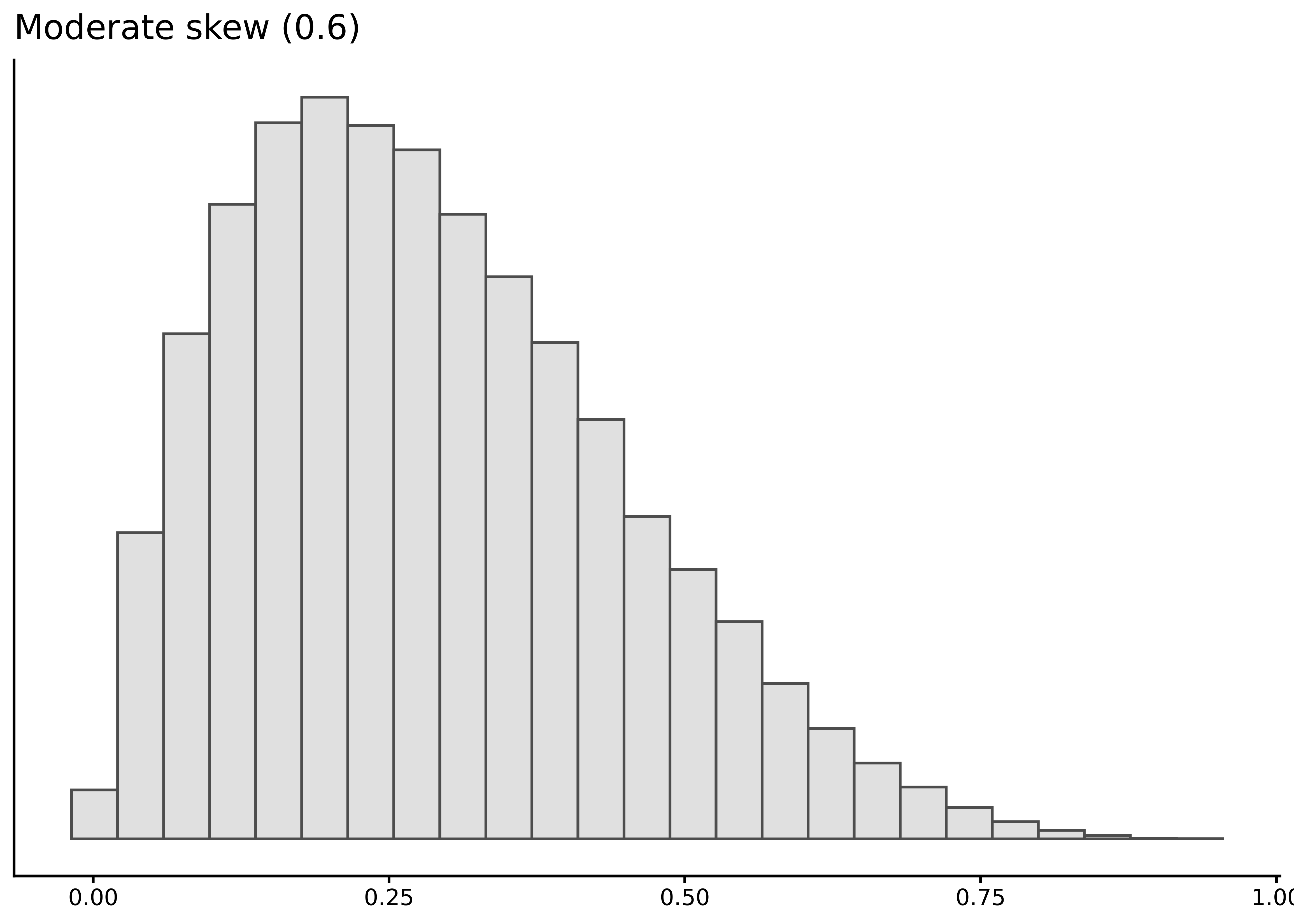
Skewness quantifies asymmetry: positive values indicate a longer right tail, negative values a longer left tail. Rules of thumb: \(|\)skewness\(|\) between 0.0–0.5 is essentially symmetric, 0.5–1.0 is moderately skewed, and greater than 1.0 is strongly skewed. For example, \(-1.5\) means strong left skew, \(0.7\) means moderate right skew.
A common shortcut: mean > median suggests right skew, mean < median suggests left skew. This is a useful tendency but not a hard rule (Hippel, 2005).
The skewness() function from sgsur (re-exported from the moments package) computes the standard coefficient:
summarise(whr2025,
          skew_happiness = skewness(happiness),
          skew_gdp       = skewness(gdp))
# A tibble: 1 × 2
skew_happiness skew_gdp
<dbl> <dbl>
1 -0.494 1.47The results show moderate left skew for happiness and strong right skew for gdp, matching the visual patterns in histograms and boxplots.
3.5.3.2 Kurtosis
Kurtosis measures tail heaviness relative to a normal distribution. Despite common misconceptions, it reflects tail weight, not peakedness (Westfall, 2014a).
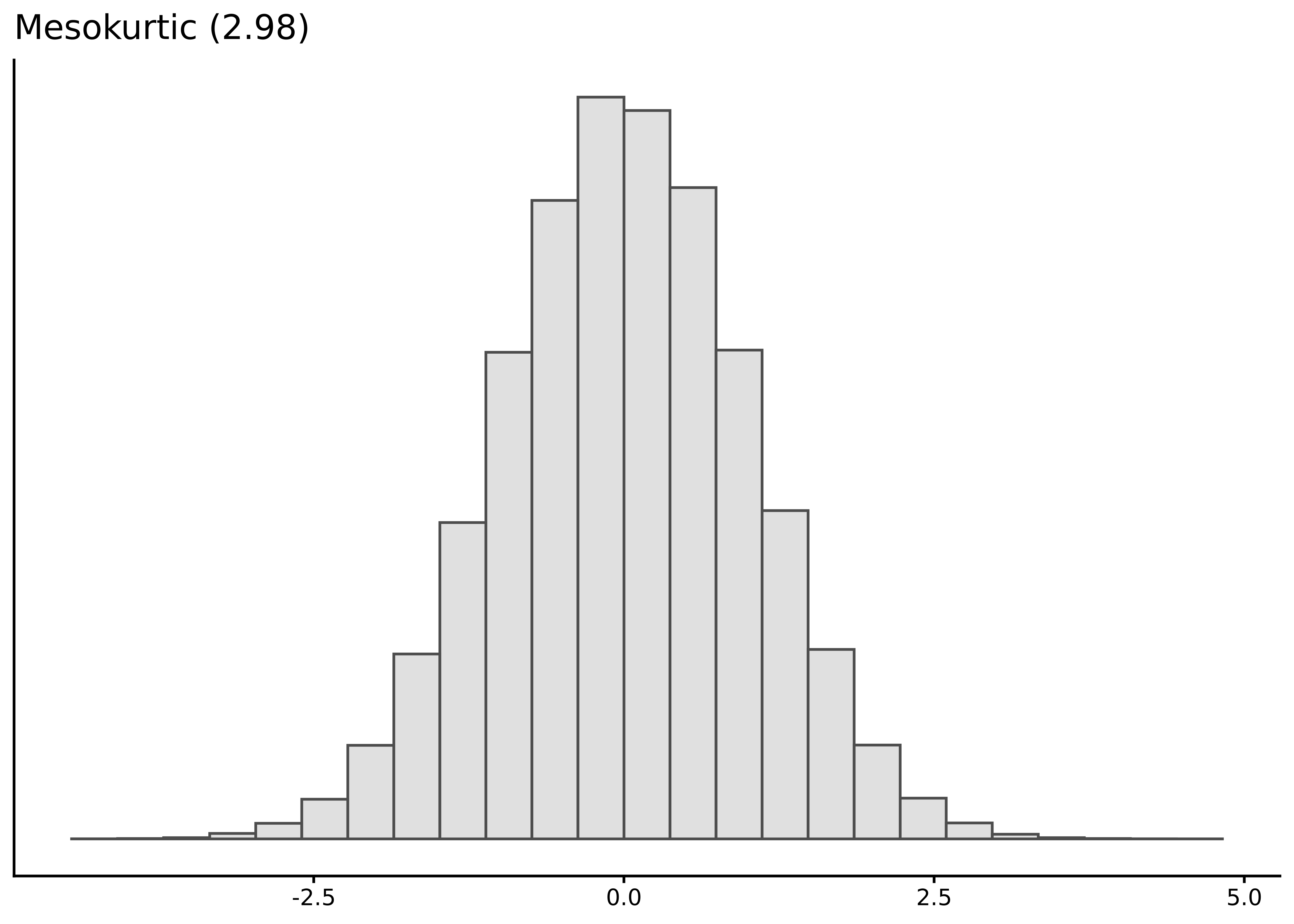
A normal distribution has raw kurtosis of 3. Many use excess kurtosis (raw minus 3) for convenience:
| Excess kurtosis | Raw kurtosis | Tail description | Regime |
|---|---|---|---|
| ≈ 0 | ≈ 3 | Normal-like tails | Mesokurtic |
| > 0 | > 3 | Heavy tails | Leptokurtic |
| < 0 | < 3 | Light tails | Platykurtic |
The kurtosis() function calculates raw kurtosis by default, or excess kurtosis with excess = TRUE:
summarise(whr2025,
          kurt_happiness = kurtosis(happiness, excess = TRUE),
          kurt_gdp       = kurtosis(gdp, excess = TRUE))
# A tibble: 1 × 2
kurt_happiness kurt_gdp
<dbl> <dbl>
1 -0.188 2.49The results show happiness near the normal benchmark, while gdp has heavy tails. Heavy tails matter in practice: extreme events become less astronomically unlikely. In finance, ignoring heavy tails can underestimate crash risk, a factor in the 2007–2008 crisis (Taleb, 2007). Positive excess kurtosis flags when normal-tail models may miss extreme risks.
3.6 Exploring relationships
Up to this point we have treated each variable in isolation; drawing a histogram or boxplot of happiness, calculating its mean or standard deviation, and so on. Those visualisations and summaries are essential, and from them we have already learned a lot about how happiness and gdp are distributed across countries. However, treating each variable in isolation leaves an obvious question unanswered: How does one variable behave when another variable changes? In other words, what can we learn from the relationships between variables?
3.6.1 Visualising conditional distributions
A first step is to compare the distribution of a numeric variable within separate levels of a discrete variable. Statisticians call such comparisons conditional, stratified, or simply grouped summaries.
The two visualisation functions we have used so far — histogram() and tukeyboxplot() — both let us explore conditional patterns. For instance, we can compare life satisfaction scores across the three income tiers by drawing a separate boxplot for each tier:
tukeyboxplot(happiness, x = income, data = whr2025)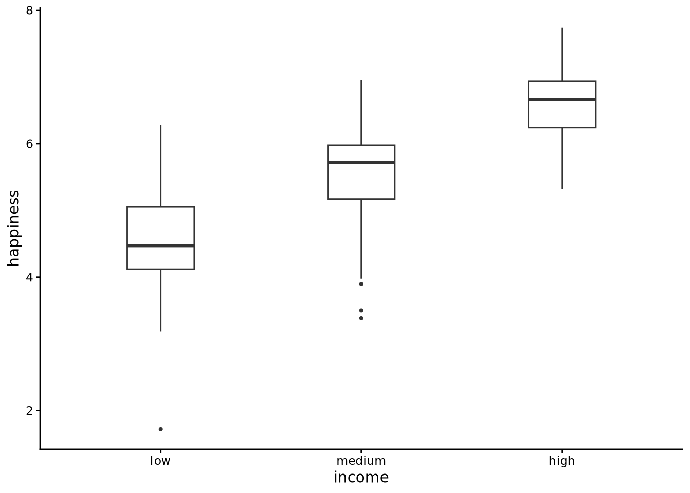
Each boxplot is read in the usual way (median line, IQR box, whiskers, and outliers), but now the left-hand box summarises happiness among low-income countries, the middle box covers the medium-income group, and the right-hand box shows the high-income group. Side by side, the three panels reveal how the centre, spread, and tails of the happiness distribution shift as national income rises.
We can easily make conditional histograms with the histogram() function. One effective approach is to use a dodged histogram with position = "dodge":
histogram(happiness, by = income, data = whr2025, position = 'dodge')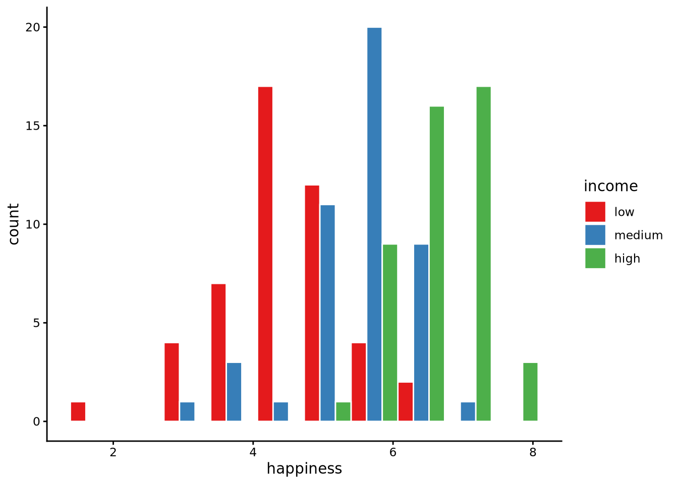
With position = "dodge" the bars belonging to the different income groups are placed side by side instead of on top of one another. Each bin along the happiness axis still has the same overall width, but inside that bin you now see three adjacent bars: one for low-, one for medium-, and one for high-income countries. This layout makes it easy to compare the absolute counts for each income tier at the same happiness level, because the bars share the same baseline.
Alternative histogram styles include stacked histograms (where bars stack vertically to show composition) and identity histograms (where bars overlap with transparency), but the dodged layout is often clearest for comparing group counts.
3.6.2 Conditional descriptive statistics
All these uses of summarise() for calculating descriptive statistics can be easily extended to perform conditional or grouped descriptive statistics by simply using .by = ....
The code below, for example, calculates the mean, median, standard deviation, and median absolute deviation of happiness separately for each income group:
summarise(
  whr2025,
  mean_happiness   = mean(happiness),
  median_happiness = median(happiness),
  sd_happiness     = sd(happiness),
  mad_happiness    = mad(happiness),
  .by = income     # group by the income factor
)
# A tibble: 3 × 5
income mean_happiness median_happiness sd_happiness mad_happiness
<ord> <dbl> <dbl> <dbl> <dbl>
1 low 4.51 4.47 0.890 0.818
2 medium 5.55 5.72 0.801 0.655
3 high 6.62 6.66 0.529 0.562income has the ordered levels low < medium < high, so the output shows a tidy table of descriptive statistics, one row per income tercile. We see that as income increases so too do the mean and median average life satisfaction. We see some change in dispersion too. Higher income countries have slightly less variability in their average life satisfaction scores than the lower income countries.
In general, you supply a variable name to .by and summarise() temporarily splits the data into all unique combinations of this variable. For each group, it evaluates every summary function you write. The result is a tibble that contains the .by columns followed by your summary columns. You can, in fact, group by more than one variable at the same time. For example, assuming we had a variable region, we could do .by = c(region, income) to get summaries for every combination of region and income group.
3.6.3 Scatterplots and correlations
Conditional distributions are only possible if the second variable has a small number of distinct values and there are many observations per value. By contrast, when the second variable is continuous — for example, gdp — there are a large number of distinct values and only one or two observations for each value. In this case, conditional boxplots, histograms, and conditional summary statistics are either impossible to calculate or are practically meaningless. In cases like these, we can easily plot each pair of happiness and gdp values as points whose horizontal coordinate is one variable and vertical coordinate is the other. The resulting cloud of dots is called a scatterplot. In the following code, we use the scatterplot() function in sgsur to produce a scatterplot of happiness and gdp:
scatterplot(x = gdp, y = happiness, data = whr2025)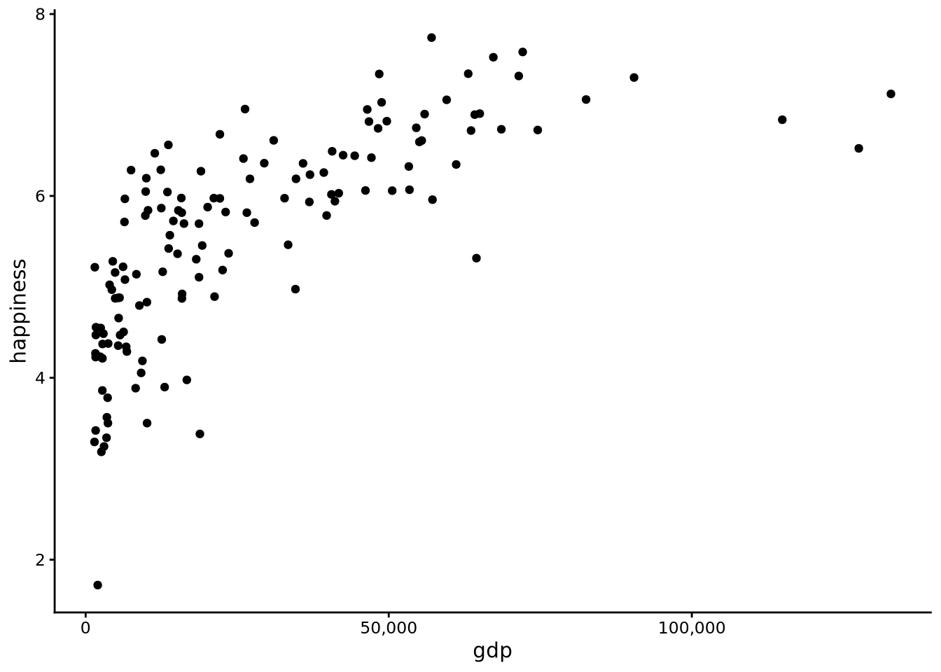
Here we see that as gdp rises from very low to moderate levels, average life satisfaction increases sharply, but the gain tapers off among the wealthiest nations. In other words, there is a positive relationship, though not exactly linear, between gdp and happiness: as one rises, the other rises too, but this relationship is not exactly like a straight line.
To enhance the scatterplot visualisation, we can add a smoother line. Think of this line as a flexible “trend-finder.” It slides a small window along the x-axis, fitting a straight line to just the points in that neighbourhood and giving closer points more weight. As the window moves, those individual local fits are stitched together into one smooth curve, so you see the overall pattern in the cloud of dots without assuming any particular functional relationship, such as a straight line, in advance. We can do this by adding + geom_smooth() after the scatterplot function call:
scatterplot(x = gdp, y = happiness, data = whr2025) + geom_smooth()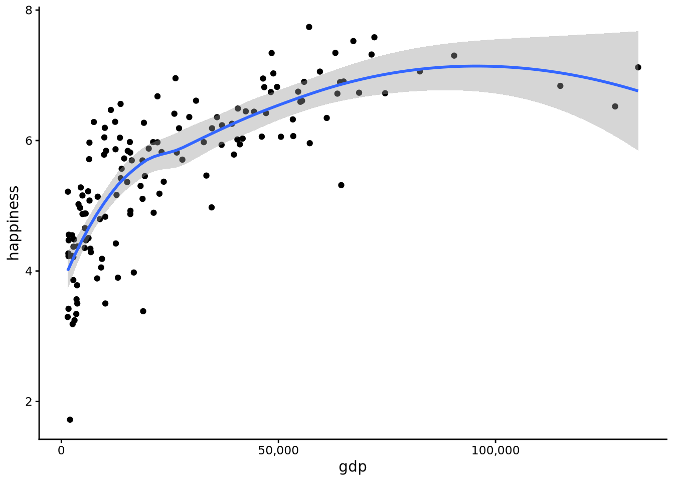
This smoother reveals a rising but nonlinear relationship: happiness increases rapidly as GDP rises from very low levels, but the rate of increase slows considerably as countries become wealthier, with the curve flattening out among the richest nations.
Once we see a relationship, we usually want a number that summarises how strong that pattern is. That job is done by a correlation coefficient. There are different kinds of correlation coefficients, but their values always range from -1 to +1. The sign (positive, negative) of the correlation shows direction: a positive value means the two variables tend to rise together, while a negative value means one tends to rise when the other falls. The size of the correlation, ignoring the sign, shows strength: values close to -1 or +1 indicate a very tight, predictable relationship, whereas values near zero signal a weak or non-existent pattern. Here is a common rule-of-thumb scale for interpreting the absolute value of the coefficient (ignoring the sign):
- 0.00 – 0.09: negligible / trivial
- 0.10 – 0.29: small / weak
- 0.30 – 0.49: moderate / medium
- 0.50 – 0.69: large / strong
- 0.70 – 0.89: very strong
- 0.90 – 1.00: nearly perfect
Different research areas adjust these cut-offs to suit their data and research objectives, so treat the numbers as flexible or approximate guidelines rather than fixed rules.
Two of the most widely used correlation coefficients are Pearson’s and Spearman’s correlations.
Pearson correlation measures the strength and direction of a straight-line relationship between two variables. Suppose the variables are \(x\) and \(y\). Pearson’s correlation coefficient, \(r\), is defined as
\[ r = \frac{\operatorname{cov}(x,y)}{s_x\,s_y}, \]
This is just saying:
- First, calculate the covariance between \(x\) and \(y\).
- Covariance is a measure of how two variables vary together.
- A positive value means that when \(x\) is above its mean, \(y\) also tends to be above its mean.
- A negative value means the opposite — when \(x\) is above its mean, \(y\) tends to be below its mean.
- Then, divide this covariance by the product (multiplication) of the standard deviations of \(x\) and \(y\) (\(s_x\) and \(s_y\)).
- This step rescales the result so that \(r\) always falls between -1 and +1, no matter the units of \(x\) and \(y\).
The result is a clean, unit-free number that captures both the direction (positive or negative) and the strength (closer to 0 = weak, closer to ±1 = strong) of the straight-line relationship.
Spearman correlation is a close cousin. It first converts both variables to ranks (1st, 2nd, 3rd, …) and then applies the same Pearson formula to those ranks instead of the raw values. Because it works with ranks, Spearman picks up any monotonic relationship — one that consistently increases or decreases — not just straight lines. It also makes Spearman less sensitive to extreme outliers, which can pull Pearson’s \(r\) around.
We can use the cor() function built in to R inside the summarise() function to calculate correlations. By default, cor() calculates the Pearson correlation, and so we use method = 'spearman' to obtain Spearman’s correlation.
summarise(
  whr2025,
  pearson_cor  = cor(gdp, happiness),
  spearman_cor = cor(gdp, happiness, method = "spearman")
)
# A tibble: 1 × 2
pearson_cor spearman_cor
<dbl> <dbl>
1 0.713 0.830The Pearson coefficients tell us how tightly the scatterplot hugs a straight line. By contrast, Spearman’s coefficient tells how tightly the scatterplot adheres to a monotonic function (one that rises consistently or falls consistently, but not necessarily in a straight line). Both coefficients are high — both very strong according to the rules of thumb presented above — but Spearman’s is higher due to the fact that the relationship between gdp and happiness is rising but not in a straight line (nonlinear).
3.7 Further reading
John W. Tukey’s Exploratory Data Analysis (Tukey, 1977) provides the timeless philosophical foundation for the “look before you test” approach to data analysis.
Kieran Healy’s Data Visualization: A Practical Introduction (Healy, 2018) teaches visualisation principles using R and
ggplot2, showing how to create effective graphics for exploring and presenting social science data.Paul H. Westfall’s “Kurtosis as Peakedness, 1905–2014: R.I.P.” (Westfall, 2014b) published in The American Statistician clears up persistent misconceptions about what kurtosis actually measures.
3.8 Chapter summary
- Exploratory data analysis is the essential first step in any data project, using visual and numeric summaries to understand variable types, ranges, patterns, and potential problems before formal modelling begins.
- Functions like
glimpse()andskim()reveal the structure of a dataset, showing variable types, missing values, and basic distributions, while codebooks provide the essential metadata needed to interpret cryptic column names. - Histograms visualise distributions by binning values and counting frequencies, revealing centre, spread, shape, and outliers, with bin count affecting the detail-versus-noise trade-off.
- Boxplots summarise distributions through five numbers (quartiles and range) and outlier points, making it easy to compare centre, spread, and asymmetry across groups or conditions.
- The mean is the centre of gravity of a distribution, sensitive to extreme values, while the median is the middle value when sorted, resistant to outliers and better representing the typical observation in skewed data.
- Dispersion measures quantify spread: the range spans min to max, the IQR captures the middle 50%, the standard deviation measures typical distance from the mean, and the MAD provides a robust alternative resistant to outliers.
- Shape is described by skewness (asymmetry, with positive values indicating right tails) and kurtosis (tail weight, with values above 3 indicating heavy tails that produce more extreme observations than a normal distribution).
- Conditional distributions and grouped summaries reveal how a variable’s centre, spread, and shape change across levels of a categorical variable, visualised with side-by-side boxplots or dodged histograms.
- Scatterplots visualise relationships between two continuous variables, with smoother lines revealing nonlinear trends and correlation coefficients quantifying strength and direction (Pearson for linear, Spearman for monotonic).
- Statistical data types (continuous, categorical, ordinal, count) describe analytical properties and guide method choice, while
Rdata types (numeric, character, factor) describe storage, and the two must be aligned for valid analysis.