This chapter on simple linear regression formally begins our coverage of regression models. However, as we will see, important foundations for this analysis were already laid in Chapter 6. Regression models are often introduced as fitting lines to points, and while there is a certain intuitive appeal to this perspective and it can help with the initial introduction, this view is ultimately limited and makes understanding regression modelling in general — of the kind we cover in all the remaining chapters of this book — harder to grasp. Put simply and generally, a regression model is a model of how the probability distribution of one variable, known as the outcome variable (among other names), varies as a function of other variables, known as the explanatory or predictor variables.
The most common or basic type of regression model is sometimes called linear regression, but we will refer to it more specifically as the normal linear model, for reasons we will explain. In brief, in normal linear models, we assume that the outcome variable is normally distributed and that its mean varies linearly with changes in a set of predictor variables. A special case of the normal linear model, and what we will cover in this chapter, is usually termed simple linear regression, which is the normal linear model with one predictor only. This model is also sometimes called bivariate regression. In brief, in simple linear regression, we assume that there is a normal distribution over some variable, the outcome variable, and this distribution shifts left or right as the value of some explanatory or predictor variable changes. Specifically, whenever the predictor variable changes by some fixed amount, the distribution over the outcome variable shifts by some fixed multiple of this amount.
The chapter covers
Simple linear regression models how an outcome variable’s probability distribution changes as a function of one predictor variable.
The slope coefficient quantifies how much the outcome changes on average for each one-unit increase in the predictor, while the intercept positions the line.
Ordinary least squares finds the line of best fit by minimising squared residuals, implemented automatically by R’s lm() function.
Inference about regression coefficients uses t-tests and confidence intervals to assess whether associations exist and estimate their magnitude with uncertainty.
Diagnostic plots of residuals check model assumptions including linearity, constant variance, normality, and independence of observations.
Fitted models generate predictions for new data, with confidence intervals for mean outcomes and prediction intervals for individual observations.
7.1 Happiness and income
As a concrete problem, we will return to the whr2025 dataset that we explored in Chapter 3.
whr2025
# A tibble: 139 × 6
   country     iso3c happiness    gdp  lgdp income
   <chr>       <chr>     <dbl>  <dbl> <dbl> <ord>
 1 Afghanistan AFG        1.72  1992.  3.30 low
 2 Albania     ALB        5.30 18244.  4.26 medium
 3 Algeria     DZA        5.36 15159.  4.18 medium
 4 Argentina   ARG        6.19 27105.  4.43 medium
 5 Armenia     ARM        5.46 19230.  4.28 medium
 6 Australia   AUS        7.06 59553.  4.77 high
 7 Austria     AUT        6.90 65015.  4.81 high
 8 Azerbaijan  AZE        4.89 21262.  4.33 medium
 9 Bahrain     BHR        5.96 57213.  4.76 high
10 Bangladesh  BGD        3.89  8242.  3.92 low
# ℹ 129 more rows
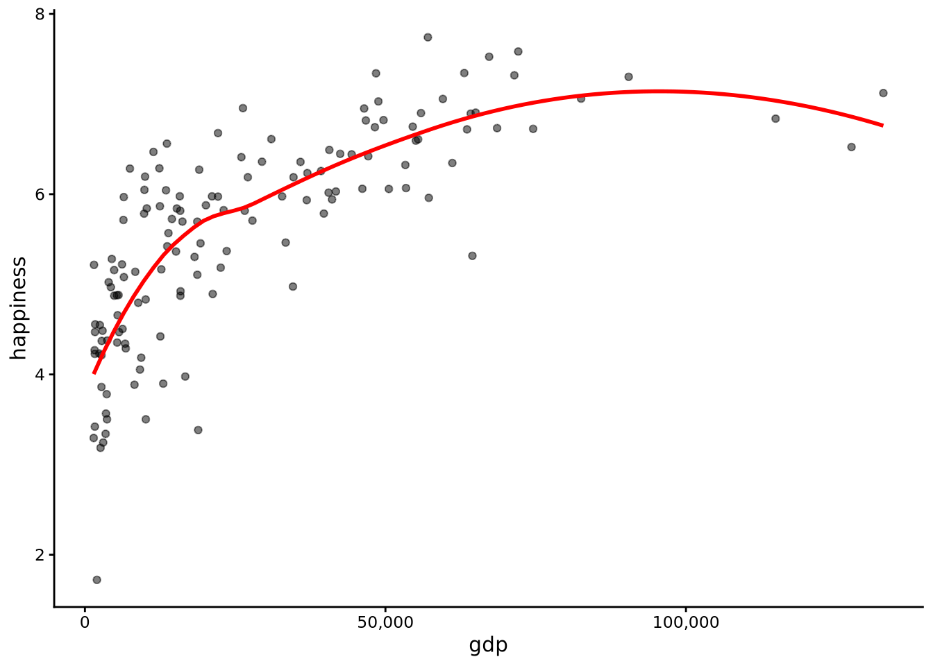
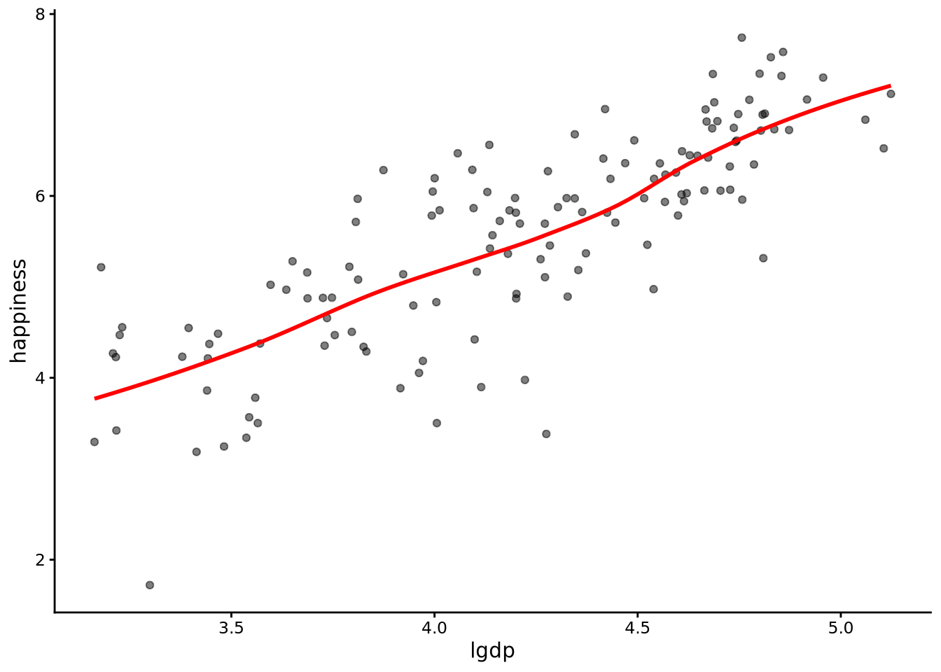
In Figure 7.1 and Figure 7.2, we show the scatterplots, along with scatterplot smoothers (see Section 3.6.3), of happiness and gdp, and happiness and the (base 10) logarithm of gdp. The way to roughly interpret the logarithm of GDP is in terms of the order of magnitude of the GDP. For example, a lgdp value of 3, 4, or 5 corresponds to GDP scores of $1,000, $10,000, and $100,000, respectively (see Note 3.2).
Figure 7.1: Scatterplot of happiness scores versus per capita GDP with a smoother line (red), showing a non-linear relationship with diminishing returns at higher GDP levels where the curve flattens out.
Figure 7.2: Scatterplot of happiness scores versus log-transformed per capita GDP with a smoother line (red), showing a roughly linear relationship after the logarithmic transformation.
From these scatterplots, we see that average happiness does not change linearly with GDP (Figure 7.1). At lower levels of income, small increases in GDP are associated with large gains in happiness, but at higher levels of income, further increases have much smaller effects. The smoother bends upwards then flattens, showing this pattern of diminishing returns. However, when we plot happiness against the logarithm of GDP (Figure 7.2), the relationship becomes roughly straight, and we can say that happiness changes linearly with the logarithm of GDP. By “changes linearly,” we mean that as one variable increases by a fixed amount, the other variable changes on average by another fixed amount.
For this reason, we will use linear regression to analyse how happiness changes as a function of the logarithm of GDP, rather than of GDP itself. Transforming variables in this way is extremely common in statistical analyses, especially when using linear models.
7.2 The simple linear regression statistical model
In a simple linear regression, we model the outcome variable (here, happiness) as being normally distributed around a mean that changes linearly with the predictor (log GDP, or lgdp). In practical terms, this means that as lgdp increases by a fixed amount, the average level of happiness increases by a fixed multiple of that amount. It’s important to note, however, that the simple linear regression model — and normal linear models more generally — do not assume that the outcome variable is normally distributed overall. Instead, they assume conditional normality: for any given value of the predictor variable (lgdp), there is a normal distribution over the outcome variable (happiness).
In more detail, in a simple linear model, we have \(n\) observations of an outcome variable: \[
y_1, y_2 \ldots y_i \ldots y_n,
\] and for each \(y_i\), we have the observation of a predictor variable: \[
x_1, x_2 \ldots x_i \ldots x_n.
\] In the present example, \(y_1, y_2 ... y_n\) are the happiness values and \(x_1, x_2 ... x_n\) are the lgdp values.
We model \(y_1, y_2 \ldots y_i \ldots y_n\) as follows: \[
\begin{aligned}
y_i &\sim N(\mu_i, \sigma^2),\quad\text{for $i \in 1 \ldots n$},\\
\mu_i &= \beta_0 + \beta_1 x_i
\end{aligned}
\] That is, each \(y_i\) is modelled as being sampled from a normal distribution with standard deviation \(\sigma\) and with a mean of \(\mu_i\). The notation \(i \in 1 \ldots n\) simply means that this relationship applies to every observation in the dataset — from the first (\((i = 1)\)) to the last (\((i = n)\)). We include a second line, \(\mu_i = \beta_0 + \beta_1 x_i\) to define that \(\mu_i\) is a linear, or straight-line, function of \(x_i\) (the predictor). In other words, it shows how \(\mu_i\) (the mean) of \(y_i\) (the outcome) changes linearly with \(x_i\) (the predictor).
There are a few things to unpack or note about this model. First, sometimes, you may see the statistical model of simple linear regression written as \[
y_i = \beta_0 + \beta_1 x_i + \epsilon_i,\quad\text{for $i \in 1 \ldots n$},
\] where each \(\epsilon_i\) is sampled from a normal distribution with a zero mean and standard deviation of \(\sigma\). There is no difference between these two ways of writing the model. Mathematically, they are identical. Both forms are useful. The first form, even if it seems more involved, centres the focus on the outcome variables being normally distributed around a mean (\(\mu_i\)) that varies as a linear model, thus making the underlying statistical model more clear. Taking this perspective also makes it much easier to see how linear regression models can be extended to different types of regression models. The second form expresses each observed value \((y_i)\) as the sum of two parts: a systematic part (\((\beta_0 + \beta_1 x_i)\)) that gives the straight line, and a random part (\(\epsilon_i\)) that represents how far the point lies above or below that line. The residuals \((\epsilon_i)\) are assumed to follow a normal distribution centred on zero, which means that, on average, half the points fall above and half fall below the fitted line.
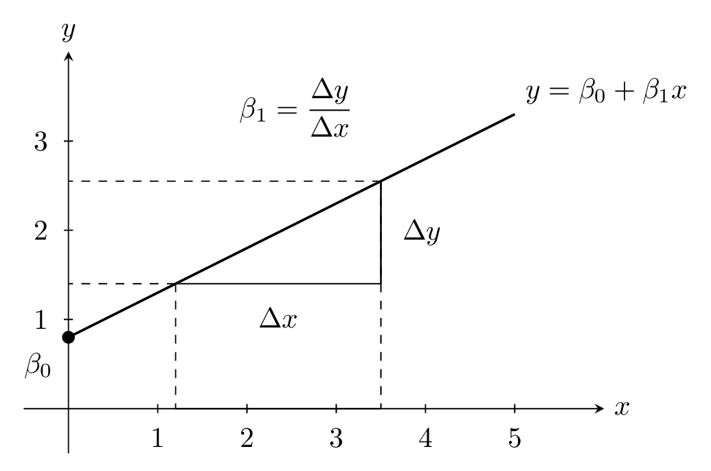
Second, a crucial part of the statistical model is the linear relationship between the mean of the outcome variable and the predictor: \(\mu_i = \beta_0 + \beta_1 x_i\). A linear relationship means that when you plot the mean \(\mu_i\) against the predictor \(x_i\) you get a straight line rather than a curve. The equation \(\mu_i = \beta_0 + \beta_1 x_i\) tells you that the line is defined by two pieces: a starting level \(\beta_0\) and an adjustment \(\beta_1 x_i\) that grows or shrinks in direct proportion to \(x_i\). The constant \(\beta_0\) is called the intercept, and it is the value of the mean when \(x_i = 0\). It tells you where the line crosses the vertical axis. The constant \(\beta_1\) is called the slope (or gradient), and it tells you how much the mean changes for each one-unit increase in \(x_i\). If \(\beta_1 = 3\), then raising \(x_i\) by 1 raises \(\mu_i\) by 3. A positive slope means the line goes up as \(x_i\) increases, a negative slope means it goes down, and a slope of zero means the mean does not change with \(x_i\) at all. The units matter: if \(x_i\) is measured in kilograms and \(\mu_i\) in centimetres, then \(\beta_1\) has units “centimetres per kilogram,” which expresses a rate of change. Sometimes \(x_i = 0\) is outside the range of your data, or even impossible (for example, a weight of zero, or height of zero) so the intercept may be a mathematical convenience rather than a meaningful real-world value, but it is still needed to position the line correctly. Together, \(\beta_0\) and \(\beta_1\) provide a simple rule: start at \(\beta_0\) and move up or down by \(\beta_1\) for every unit step you take along the \(x\)-axis. This is illustrated in Figure 7.3.
Figure 7.3: A straight line illustrating the linear function \(y = \beta_0 + \beta_1 x\). The point where the line crosses the \(y\)-axis is the intercept \(\beta_0\). The slope \(\beta_1\) is the change in \(y\), represented by \(\Delta y\), over the corresponding change in \(x\), represented by \(\Delta x\). In other words, when \(x\) changes by \(\Delta x\), then \(y\) changes by \(\Delta y\) where \(\Delta y = \beta_1 \Delta x\).
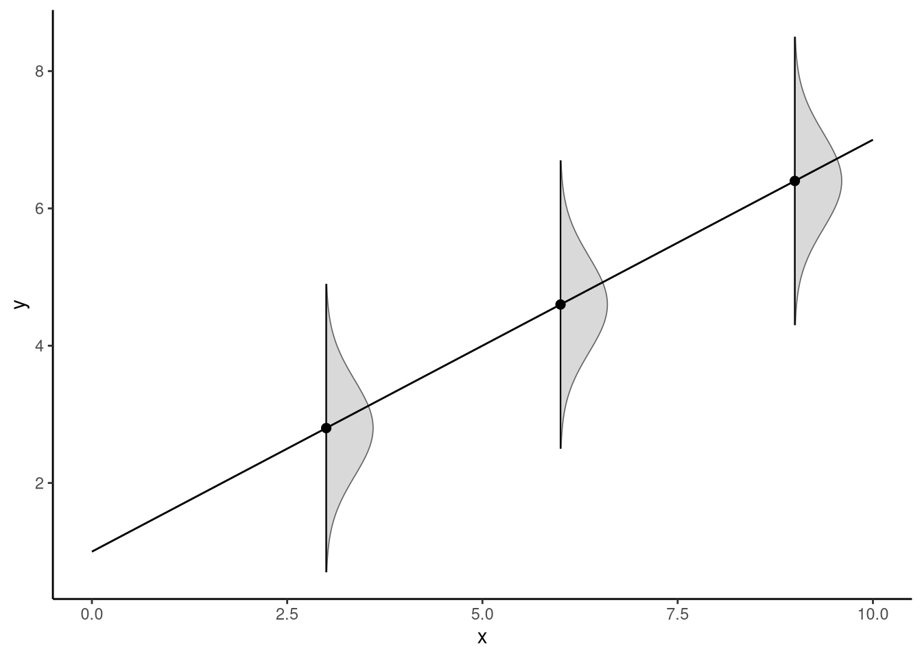
Figure 7.4 illustrates the statistical model assumed in simple linear regression. For any value of the predictor \(x\), there is a normal distribution over the outcome \(y\). The standard deviation of this distribution is fixed (though unknown), and so effectively the centre of the normal distribution over \(y\) shifts upwards (if the slope is positive) or downwards (if the slope is negative) as \(x\) increases.
Figure 7.4: The statistical model inherent in simple linear regression assumes that for every possible value of the predictor variable \(x\), the distribution over \(y\) is normal with a fixed standard deviation — a property known as conditional normality
7.3 Estimation and model fitting
The statistical model that is inherent in simple linear regression has three unknown variables: the intercept term \(\beta_0\), the slope term \(\beta_1\), and the standard deviation of the normal distribution over the outcome variable \(\sigma\). We need to use statistical inference to infer what their values are on the basis of our sample of data. Just like in Chapter 4 and Chapter 6, inference will involve the twin tools of hypothesis testing with p-values and confidence intervals.
The inference procedure can be broken down into three steps:
Estimate the values of \(\beta_0\), \(\beta_1\), and \(\sigma\), which we will term \(\hat{\beta}_0\), \(\hat{\beta}_1\), \(\hat{\sigma}\). As discussed in Section 6.1.1, estimates can be seen as best guesses of the values of the unknown parameters. For each one, we use formulas called estimators. In general in statistics, an estimator is a rule or formula to calculate a value of an unknown parameter from a sample.
Determine the sampling distribution for the estimators. The sampling distribution is the probability distribution of the estimates across all possible samples of the same size from the population. It tells us how the estimates would vary if we could repeatedly draw samples and calculate the estimator each time.
Use the sampling distribution to obtain the p-value for any hypotheses of interest, and more generally to obtain a confidence interval for each unknown parameter.
7.3.1 The line of best fit
The estimates, or best guesses, \(\hat{\beta}_0\), \(\hat{\beta}_1\), \(\hat{\sigma}\) are obtained by finding the line of best fit. This is the straight line that, out of all possible straight lines, best fits the scatterplot of data points. The “best” fit is defined in terms of minimising the sum of squared residuals. The residuals for the fitted line, which we denote by \(\hat{\epsilon}_1, \hat{\epsilon}_2 \ldots \hat{\epsilon}_n\), represent how much each observed value differs from the fitted line (see Note 7.1).
Note 7.1: Residuals
For a simple linear regression model with fitted line \(\hat{\mu}_i = \hat{\beta}_0 + \hat{\beta}_1 x_i\), the residual for observation \(i\) is defined as: \[
\hat{\epsilon}_i = y_i - \hat{\mu}_i = y_i - (\hat{\beta}_0 + \hat{\beta}_1 x_i)
\] where:
\(y_i\) is the observed value of the outcome variable for observation \(i\)
\(x_i\) is the observed value of the predictor variable for observation \(i\)
\(\hat{\beta}_0\) and \(\hat{\beta}_1\) are the intercept and slope of the fitted line
\(\hat{\mu}_i\) is the \(y\) value of the fitted regression line for observation \(i\); it is the predicted mean of the normal distribution over \(y\) at the \(x_i\) value
The first equals sign defines what a residual is — the difference between the observed value (\(y_i\)) and the model’s expected value (\(\hat{\mu}_i\)). The second equals sign simply substitutes the fitted equation \((\hat{\beta}_0 + \hat{\beta}_1 x_i)\) for \(\hat{\mu}_i\), showing how the model’s expected value is calculated from the estimated intercept and slope.
Positive residuals indicate the observed value is above the model’s expected value, while negative residuals indicate the observed value is below he model’s expected value. The collection of all residuals \(\hat{\epsilon}_1, \hat{\epsilon}_2, \ldots, \hat{\epsilon}_n\) represents the observed variability around the fitted regression line and forms the basis for assessing model fit and checking model assumptions.
In other words, the line of best fit is the line that minimises the sum of the squared residuals, also known as the residual sum of squares (RSS): \[
\textrm{RSS} = \sum_{i=1}^n \hat{\epsilon}_i^2.
\]
Remember, \(\Sigma\) means “sum over”, so this equation is telling us that we add up the squared residuals for every observation, from \(i = 1\) to \(i = n\) to obtain the RSS.
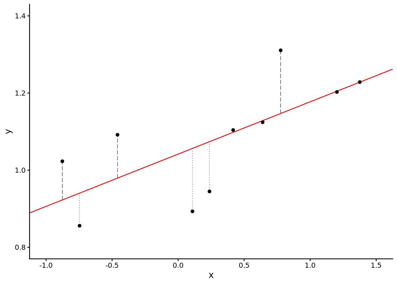
One reason we use the sum of the squares of the residuals, rather than the sum of the residuals themselves, is because otherwise the residuals above and below could cancel each other and the sum could be zero. So the larger the RSS, the poorer the fit of the line to the scatterplot. Our aim in model fitting, therefore, is to essentially try out all possible values of \(\hat{\beta}_0\) and \(\hat{\beta}_1\), calculate the residuals defined by that fitted line, and then find those values of \(\hat{\beta}_0\) and \(\hat{\beta}_1\) that minimise \(\textrm{RSS}\) (see Figure 7.5).
Figure 7.5: A scatterplot showing the relationship between two variables x and y, with 10 data points and the best fitting line calculated using ordinary least squares regression. The residuals are shown as vertical dashed lines. This line minimises the residual sum of squares, providing the optimal fit to the data among all possible straight lines.
To find the line that minimises the RSS, we don’t have to exhaustively try endless combinations of values for the slope and intercept. There are formulas that directly calculate the values of \(\hat{\beta}_0\) and \(\hat{\beta}_1\) that minimise the RSS. These formulas are guaranteed to give us the unique best-fitting line.
If we denote the mean of \(y_1, y_2 \ldots y_n\) and \(x_1, x_2 \ldots x_n\) by \(\bar{y}\) and \(\bar{x}\), respectively, and denote the standard deviation of \(x\) by \(s_x\) (and so the variance is \(s^2_x\)), then the formulas to calculate the slope and intercept of the line of best fit are as follows: \[
\hat\beta_1=\frac{\operatorname{cov}(x,y)}{s^2_x} = \frac{\sum_{i=1}^{n}(x_i-\bar x)(y_i-\bar y)}{\sum_{i=1}^{n}(x_i-\bar x)^2},\qquad
\hat\beta_0=\bar y-\hat\beta_1\bar x.
\] In other words, the slope is the covariance of \(x\) and \(y\) (see Note 7.2) divided by the variance of \(x\). The intercept is then calculated by subtracting the slope times the mean of \(x\) from the mean of \(y\). It is useful to also see the slope can also be calculated from the Pearson correlation coefficient (see Section 3.6.3): \[
\hat\beta_1= r \frac{s_y}{s_x},\quad \left(\text{and conversely, } r = \hat\beta_1 \frac{s_x}{s_y}\right),
\] where \(s_y\) is the standard deviation of the outcome variable. The relationship between the correlation and the slope shows that the sign of the slope matches the sign of the correlation and that its magnitude rescales the correlation by the ratio of the standard deviation of \(y\) to that of \(x\).
Once we have \(\hat \beta_0\) and \(\hat \beta_1\), we can obtain the residuals for each point as follows: \[
\hat\varepsilon_i=y_i-\hat\beta_0-\hat\beta_1 x_i,
\] and so \(\textrm{RSS}\) is the sum of the squares of these residuals. The estimator of the model’s standard deviation is calculated from this value of \(\textrm{RSS}\): \[
\hat{\sigma} = \sqrt{\frac{\textrm{RSS}}{n-2}}
\]
It is important to remember that these are our best estimates of the true population parameters, not the parameters themselves, which in practice we can never observe directly. Were we to repeatedly draw samples from the population, we could calculate these estimates for each sample, and the resulting values would form a distribution. This distribution is known as the sampling distribution. For both the intercept and slope terms, these sampling distributions follow a t distribution for very similar mathematical reasons to those underlying the inferential statistical results covered in Chapter 6. In particular, closely paralleling results in Section 6.2, Section 6.4, and Section 6.5, for both the intercept and slope coefficients, we have the following results: \[
\frac{\hat\beta_0-\beta_0}{\operatorname{SE}(\hat\beta_0)} \sim\textrm{Student-t}(n-2),\quad
\frac{\hat\beta_1-\beta_1}{\operatorname{SE}(\hat\beta_1)} \sim\textrm{Student-t}(n-2)
\] That is, for either coefficient, we take our sample-based estimate and compare it to a hypothesised population value for that parameter. Just as in earlier t-tests, this comparison tells us how far our sample estimate is from the hypothesised value in standard error units, allowing us to test whether any observed difference is larger than we would expect if the null hypothesis were true.
We won’t derive the standard error terms here as they are more complex than in the case of the t-tests covered in Chapter 6, but like before, they will be based on measures of variability in the sample and the sample size. They will be calculated for us by R, as we will see below.
With these sampling distributions, hypothesis tests and p‑values proceed just as before. For example, a common null hypothesis is that there is no association between the outcome variable and the predictor in the population, which is to say that the population slope coefficient is zero: \(H_0 \colon \beta_1=0\). To test this, we calculate the null hypothesis test statistic: \[
\frac{\hat\beta_1-0}{\operatorname{SE}(\hat\beta_1)} = \frac{\hat\beta_1}{\operatorname{SE}(\hat\beta_1)}.
\] If the null hypothesis is true, this statistic will have a standard t-distribution and, using identical methods to those used in Chapter 6, we can calculate the probability of obtaining a result as or more extreme than the t-statistic we calculated, which is the p-value. Using the same logic as before, low p-values, lower than the conventional threshold of \(0.05\), indicate a low degree of compatibility between the observed data and the hypothesis that \(\beta_1 = 0\).
Hypothesis tests on the intercept are obtained in the same way. However, these are rarely of substantive interest unless the value predictor \(x=0\) is meaningful. In our case, for example, the predictor variable equal to zero corresponds to an annual per capita GDP of $1 and so is an impossibly low and almost practically meaningless value.
A \(\gamma\), such as \(\gamma = 0.95\), confidence interval for either coefficient is its estimate plus or minus a \(t\) critical value, \(T(\gamma,n-2)\), times its standard error: \[
\hat\beta_j \pm T(\gamma, n-2) \operatorname{SE}(\hat\beta_j), \qquad j\in\{0,1\}.
\] Here, the subscript \(j\) simply indexes which coefficient we are referring to: when \(j = 0\), \(\hat\beta_0\) is the intercept, when \(j = 1\), \(\hat\beta_1\) is the slope. Writing \(j \in {0,1}\) is just a compact way of saying “this formula applies to both coefficients.”
Each confidence interval is centred on the estimated coefficient (\(\hat\beta_j\)) and extends above and below it by a margin of error, obtained by multiplying the t-critical value, \(T(\gamma, n-2)\), by the standard error of that coefficient, \(\operatorname{SE}(\hat\beta_j)\). The t-critical value reflects the chosen confidence level (for example, 95%) and the amount of data available (represented by \(n-2\) degrees of freedom). See Note 6.3 for details on how these t-critical values are obtained. In brief, the resulting intervals capture the range of population parameter values most compatible with the data, based on the estimated coefficients \(\hat\beta_0\) and \(\hat\beta_1\).
7.4 Using lm()
To perform linear regression in R, we use the lm() function. This approach works for both simple linear regression (with one predictor variable) and multiple regression (with multiple predictors, as discussed in Chapter 8). In the following example, we perform a simple linear regression using happiness as the outcome variable and lgdp as the predictor:
M_7_1 <-lm(happiness ~ lgdp, data = whr2025)
We assign the output to the object M_7_1, so no output is displayed immediately. The first argument to the lm() function is the formula happiness ~ lgdp. This follows the familiar R formula syntax we encountered with the t.test() function in Chapter 6. For simple linear regression, the formula structure is always outcome ~ predictor.
To examine the results of the regression analysis, we typically begin by using the summary() function:
summary(M_7_1)
Call:
lm(formula = happiness ~ lgdp, data = whr2025)

Residuals:
     Min       1Q   Median       3Q      Max
-2.30386 -0.33678  0.06311  0.45192  1.56761

Coefficients:
            Estimate Std. Error t value Pr(>|t|)
(Intercept)  -2.2663     0.4900  -4.625 8.57e-06 ***
lgdp          1.8603     0.1157  16.072  < 2e-16 ***
---
Signif. codes:  0 '***' 0.001 '**' 0.01 '*' 0.05 '.' 0.1 ' ' 1

Residual standard error: 0.678 on 137 degrees of freedom
Multiple R-squared:  0.6534,    Adjusted R-squared:  0.6509
F-statistic: 258.3 on 1 and 137 DF,  p-value: < 2.2e-16
This shows most, but not all, of the main results of the analysis. We can break this output down into a few main parts.
Residuals
The five numbers under “Residuals” are a compact summary of the distribution of the residuals \(\hat\epsilon_i = y_i-\hat y_i\). “Min” and “Max” show the most negative and most positive residuals, and the three quartiles (1Q, Median, 3Q) split the residuals into four equal parts. A median close to 0 indicates that the fitted line runs through the middle of the data, as it should when the assumption of normality is met. Rough symmetry between the magnitudes of Min and Max, and similar distances of 1Q and 3Q from 0, suggest that the residuals are roughly symmetric with no gross outliers. Large asymmetry or very long tails would prompt us to take a closer look at the residual plots.
Coefficients table
The table under Coefficients: provides the estimates of the coefficients of the linear equation as well as some of their main inferential statistics results.
The “Estimate” column reports the estimates \(\hat\beta_0\) and \(\hat\beta_1\) introduced earlier. Here, the intercept \(\hat\beta_0=-2.2663\) is the fitted mean happiness when \(\texttt{lgdp}=0\) (i.e. at GDP \(=10^{0}=1\), which is not substantively meaningful but is needed to position the line), and the slope \(\hat\beta_1=1.8603\) is the change in the mean for a one‑unit increase in \(\texttt{lgdp}\). Because \(\texttt{lgdp}\) is base‑10 log GDP, a one‑unit increase in lgdp is a 10‑fold increase in GDP and is associated with about \(1.86\) points higher happiness. In other words, as we go from per capita GDP of $1000 to $10,000 to $100,000, happiness increases by 1.86 units on average. Likewise, a doubling of GDP corresponds to \(0.301\) units (\(\log_{10}(2) = 0.301\)) of \(\texttt{lgdp}\) and therefore about \(0.301\times 1.8603 \approx 0.56\) points higher happiness.
The “Std. Error” column gives the standard errors of the estimates. These are the estimated standard deviations of the sampling distributions discussed in Section 7.3.
The “t value” is the t-statistic for the null hypothesis test for the coefficient. It is the estimate divided by its standard error, \(t = \hat\beta_j / \operatorname{SE}(\hat\beta_j)\) (for \(j=0,1\)). As mentioned above, under the null hypothesis \(H_0:\beta_j=0\), this t-statistic follows a \(t\) distribution with \(n-2\) degrees of freedom.
The “Pr(>|t|)” column is the corresponding p‑value for the null hypothesis test. It is written this way because it is the probability that the t-statistic has absolute value at least as large as the observed \(t\). The tiny p‑value for both coefficients (for the slope, it is printed as “< 2e‑16”) indicates that the null hypothesis is not compatible with the data. For example, we can reject the null hypothesis that there is a zero slope.
The stars are R’s conventional significance codes. For example, *** indicates \(p < 0.001\).
Residual standard error:
The “Residual standard error: 0.678 on 137 degrees of freedom” reports \(\hat{\sigma}=\sqrt{\mathrm{RSS}/(n-2)}\), our estimate of the model’s normal distribution standard deviation \(\sigma\). What this tells us is that for every possible value of lgdp, there is a normal distribution over happiness whose standard deviation is estimated to be \(\hat{\sigma}=0.678\). The phrase “standard error” is in fact a misnomer here. The \(\hat{\sigma}\) is not the standard error of a parameter estimate, so the more correct term is residual standard deviation. The “137 degrees of freedom” equals \(n-2\), where \(n=139\).
Model summary
R also reports the fraction of variance explained, \(R^2\), its small‑sample adjustment, adjusted \(R^2\), and an overall F‑test of the model. We defer detailed discussion to Chapter 8. For simple regression, it is enough to note that \(R^2\) equals the squared sample correlation between \(\texttt{happiness}\) and \(\texttt{lgdp}\), which is \(0.808\), and the F‑statistic is exactly the square of the slope \(t\) statistic.
Note 7.2: Manual calculation of regression estimates
The lm() function in R will calculate the line of best fit and other important quantities, but it can be useful to calculate them directly using general-purpose tools like summarise().
For example, here we calculate the slope and the intercept using summarise():
Here, we calculate the residuals using mutate() and then use summarise() to calculate the sum of their squares, which is \(\textrm{RSS}\), and the square root of \(\textrm{RSS}\) divided by \(n-2\) is \(\hat{\sigma}\), the estimate of the standard deviation:
As generally useful as summary() is, it does not return the confidence intervals for the coefficients. These can be obtained using the confint() function:
By default, we obtain the 95% confidence interval. We can change this level, for example to the 99% confidence using level = 0.99 when we call confint().
These intervals give the ranges of population coefficient values that are compatible with the data; those values that would not be rejected at the 0.05 level of significance. The intercept confidence interval \([-3.24,-1.30]\) is the happiness mean when \(\texttt{lgdp}=0\) (GDP \(=1\)), which as we noted is not substantively meaningful. For the slope, on the other hand, the confidence interval is very informative. It indicates that for a one‑unit increase in \(\texttt{lgdp}\) (a ten‑fold increase in GDP) the mean happiness is estimated to rise between about \(1.63\) and \(2.09\) points. Equivalently, a doubling of GDP corresponds to \(\Delta\texttt{lgdp}= \log_{10}(2) \approx 0.301\), implying an increase in mean happiness between \(0.49\) and \(0.63\) points. Because 0 is not in the slope interval, the test of \(H_0:\beta_1=0\) is significant at the 5% level, in agreement with the p‑value in the summary output.
While summary() and confint() are great for a quick look, the tidy() function from sgsur (re-exported from broom) returns the coefficients table as a tibble, optionally including the confidence intervals too:
Here, estimate is \(\hat\beta\), std.error is the standard error, statistic is the \(t\) statistic for the null hypothesis, p.value is its p-value, and conf.low/conf.high give the confidence interval endpoints at the chosen level (default 95%). Because it is a tibble, you can filter, mutate, round, join, and print it alongside other results without parsing console text.
7.5 Predictions
Prediction is one of the main uses of regression models. We often want to predict the outcome variable for new values of the predictor that we haven’t directly observed. For example, we may want to predict happiness for a country with per capita GDP of exactly $50,000 (lgdp = 4.69897), even though no country in our dataset has precisely this value.
For any new predictor value \(x^*\), our regression model predicts a probability distribution, a normal distribution, over the outcome variable. The predicted mean of this normal distribution is: \[
\hat{\mu}(x^*) = \hat\beta_0 + \hat\beta_1 x^*
\] Because \(\hat\beta_0\) and \(\hat\beta_1\) are themselves estimates, the predicted mean \(\hat{\mu}(x^*)\) too is not known with certainty. A confidence interval for the predicted mean response at \(x^*\) captures this estimation uncertainty. The formula for this confidence interval is like that for the confidence intervals of the coefficients: \[
\hat{\mu}(x^*) \pm T(\gamma, n-2)\;\operatorname{SE}(\hat{\mu}(x^*)),
\] where \(T(\gamma,n-2)\) is the \(t\) critical value as before (see Note 6.3), and \(\operatorname{SE}(\hat{\mu}(x^*))\) is the standard error of the fitted mean, which R will compute for us. The 95% confidence interval for the predicted mean \(\hat{\mu}(x^*)\) is the range of population mean values \(\mu(x^*)\) that are compatible with the data.
At a chosen predictor value \(x^*\), there is a normal distribution over the possible values of the outcome variable. A 95% prediction interval for a new observation \(x^*\) combines two sources of uncertainty: uncertainty in the estimated mean, and the intrinsic normal distribution of values around that mean. The resulting interval is \[
\hat{y}(x^*) \pm T(\gamma, n-2) \operatorname{SE}_\text{pred}(x^*),
\] where \(T(\gamma,n-2)\) is the \(t\) critical value with \(n-2\) degrees of freedom, and \(\operatorname{SE}_\text{pred}(x^*)\) is another standard error term specific to \(x^*\), which R will compute for us. In substantive terms, a 95% prediction interval at a given lgdp value describes the plausible range of happiness scores a single country might show at that income level, allowing both for uncertainty concerning the mean of the distribution and for country‑to‑country variability around the mean.
There are multiple ways in which we can perform regression predictions using R. Here, we will use the augment() function from the sgsur package (re-exported from broom). Let’s say we want to predict the mean happiness score for each integer value of lgdp from 1 (equivalent to $10 per capita GDP) to 5 (equivalent to $100,000 per capita GDP). First, we create a data frame with one variable, lgdp, and the values 1 to 5
new_lgdp <-tibble(lgdp =1:5)
This is a simple data frame with one variable and five rows:
new_lgdp
# A tibble: 5 × 1
   lgdp
  <int>
1     1
2     2
3     3
4     4
5     5
To obtain the predicted means of happiness corresponding to each value of new_lgdp, we do the following:
All we are doing here is applying the linear equation, \(\hat{\mu}(x^*) = \hat\beta_0 + \hat\beta_1 x^*\), to each value of \(x^*\) from 1 to 5. For example, when \(x^* = 1\), then \[
\hat{\mu}(x^*) = \hat\beta_0 + \hat\beta_1 x^* = -2.266 + 1.86 \times 1 = -0.406.
\]
To obtain the confidence intervals for predicted means of happiness corresponding to each value of new_lgdp, we can again use augment():
To summarise these results, consider a country with lgdp = 4 (per capita GDP of $10,000). Our regression model predicts that happiness for such a country would be a normal distribution with a mean whose 95% confidence interval is from 5.05 to 5.3. However, individual countries will vary around this predicted mean due to natural variability of the normal distribution. Accounting for both our uncertainty in the mean prediction and this inherent variability, we expect about 95% of countries with lgdp = 4 to have happiness values between 3.83 and 6.52.
7.6 Model diagnostics
The statistical model inherent in simple linear regression assumes a number of things about the data. It assumes that the mean of the outcome variable is linear in the predictor. For example, in the current analysis, this means that as lgdp increases by a fixed amount \(\Delta\), then the corresponding average value of happiness increases by some fixed multiple \(\beta_1\) of this amount. Increasing lgdp by \(\Delta\) leads to the same average increase in happiness, \(\beta_1 \Delta\), regardless of the initial lgdp value. The model also assumes the variability around this conditional mean is normally distributed. This entails that residuals, which are the differences between the observed values and means, should be centred at zero, symmetric, and bell-shaped. These normal distributions around the means are assumed to have constant variance (homoscedasticity); the standard deviation does not change as the predictor variable changes. Observations are also assumed to be independent. This means, for example, that there should be no correlations of the residuals from one observation to the next.
We can diagnose many of these key assumptions using summary statistics and visualisations because systematic departures from the model typically show up as clear and visible patterns.
7.6.1 Distribution of residuals
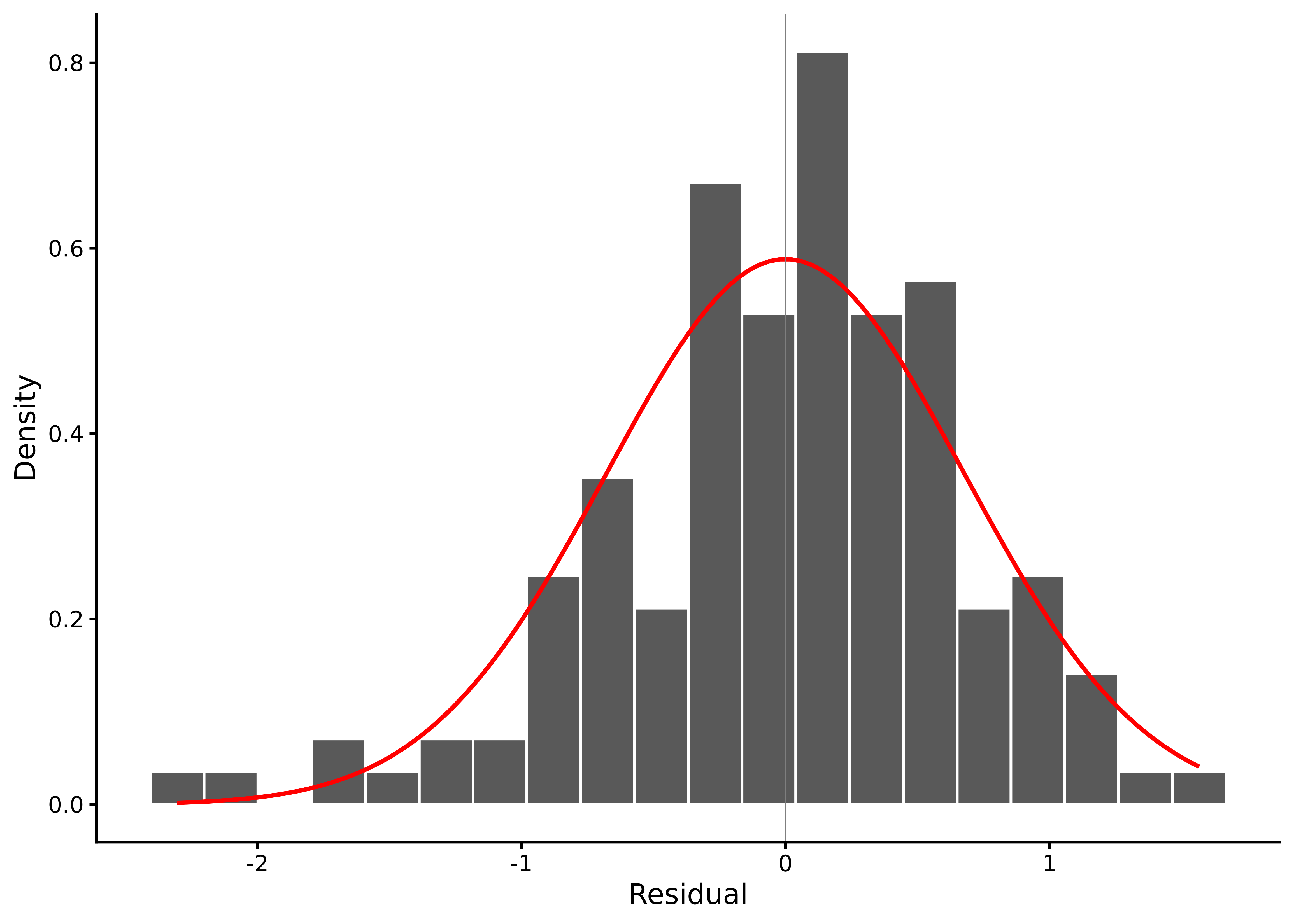
One of the most straightforward diagnostics is to look at and describe the distribution of residuals. The function lm_diagnostic_plot() from sgsur, when used with the type = 'hist' argument, will plot a histogram of the residuals (see Figure 7.6):
lm_diagnostic_plot(M_7_1, type ='hist')
Figure 7.6: Histogram of residuals from the happiness ~ lgdp model.
What we are looking for here, if the assumptions are correct, is a normal distribution centred at 0. In this plot, this is largely the case, but with some relatively mild left skew.
We can also examine the skewness and kurtosis. The residual_shape_ci() function, also from sgsur, will calculate the skewness (see Section 3.5.3.1) and kurtosis (see Section 3.5.3.2) of the residuals as well as provide bootstrap confidence intervals for both:
What we should be on the lookout for here is relatively clear evidence for left or right skew or leptokurtic or platykurtic distributions. This can be ascertained by looking at the confidence intervals and whether they contain 0 for skew or 3 for kurtosis. In this model, we do see that there is evidence for a negative skew.
7.6.2 Residuals vs fitted
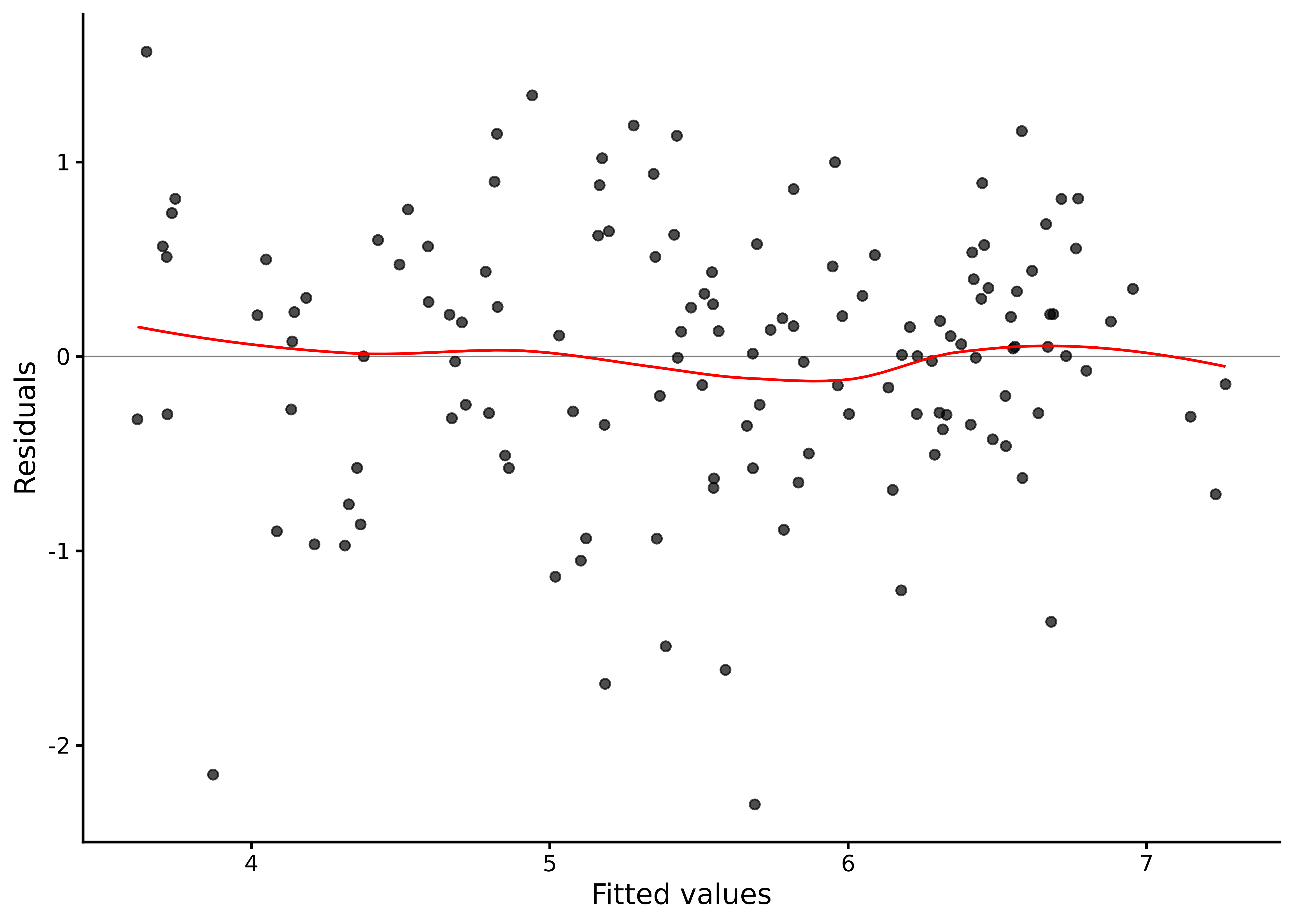
A common diagnostic plot used is the residuals versus fitted plot, which is available with the function lm_diagnostic_plot() using type = 'resid' (see Figure 7.7):
lm_diagnostic_plot(M_7_1, type ='resid')
Figure 7.7: Residuals versus fitted values for the happiness ~ lgdp model.
This plot shows each raw residual \(\hat\epsilon_i=y_i-\hat \mu_i\) against the fitted mean \(\hat \mu_i = \hat{\beta}_0 + \hat{\beta}_1 x_i\) for that point. If the linear model is correct and the variance is roughly constant, the points should form a horizontal band around zero with no systematic pattern. In the plot, the scatterplot smoother is shown in red. Serious curvature indicates nonlinearity in the relationship between the predictor and the average of the outcome variable. A funnel shape to the scatterplot indicates non‑constant variability in the residuals (heteroscedasticity). Isolated large residuals indicate possible outliers.
For the happiness ~ lgdp model, there is no obvious systematic curve, which supports the choice of a straight‑line mean on the logarithmic GDP scale. The spread does not noticeably increase or decrease with the fitted values, so there is no strong evidence of heteroscedasticity. The residuals mostly occur within \(\pm 2\) times the residual standard deviation (\(\hat{\sigma} = 0.68\)), but the plot does show some points somewhat below the band, consistent with the negative skew we saw earlier.
7.6.3 Normal Q–Q plot
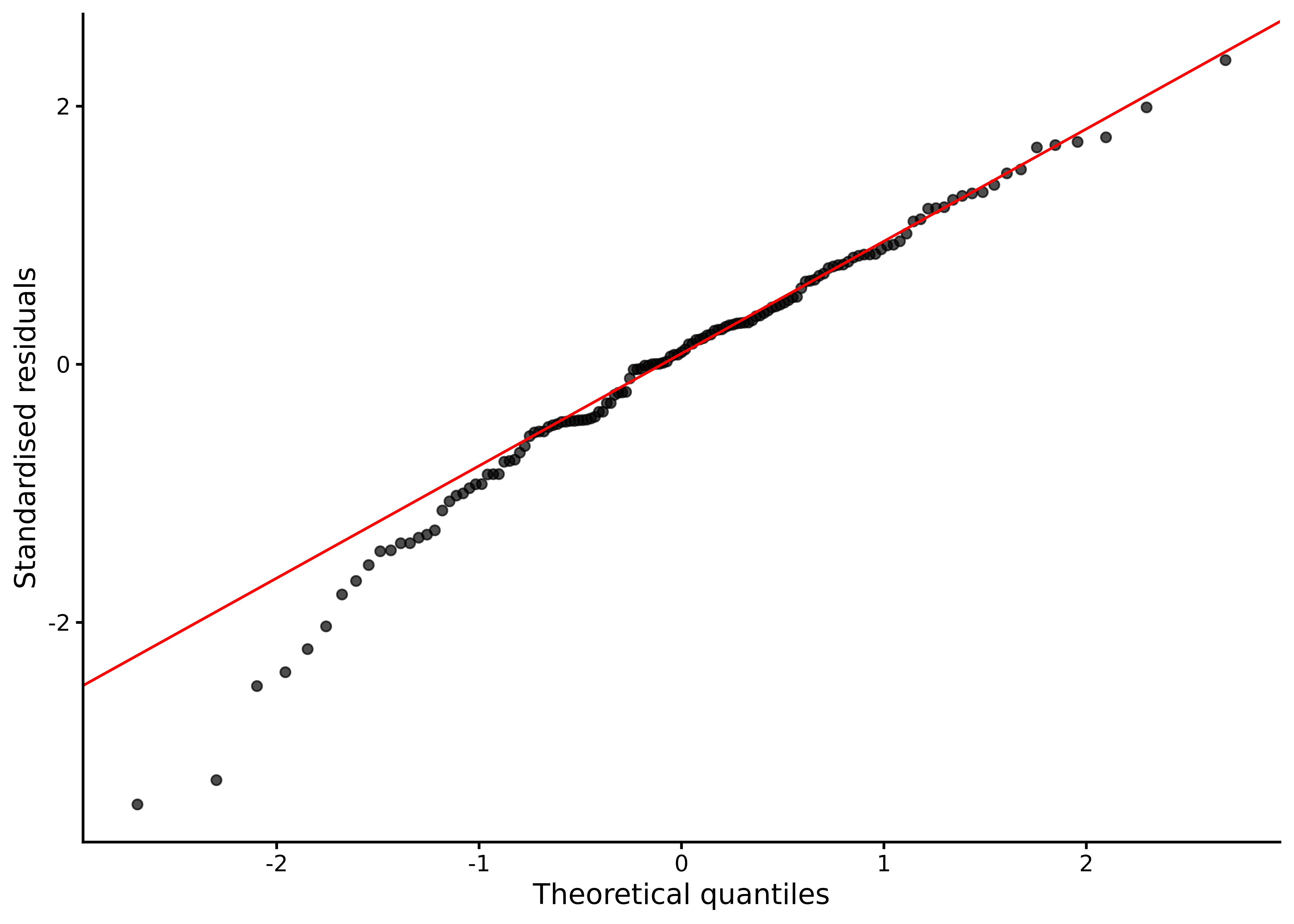
The QQ-plot (see Section 6.3) of the residuals in the model can be obtained from lm_diagnostic_plot() using type = 'qq' (see Figure 7.8):
lm_diagnostic_plot(M_7_1, type ='qq')
Figure 7.8: Normal Q-Q plot of residuals from the happiness ~ lgdp model.
As covered in Section 6.3, the Q–Q plot orders the standardised residuals and compares them to the quantiles of a standard normal distribution. Points close to the diagonal reference line indicate residuals that are close to normal; systematic S‑shapes indicate skewness, and tails that bend away from the line indicate heavier‑than‑normal tails.
For the current model, most points lie close to the line, indicating that the residual distribution is near‑normal. The lower tail drops a little below the line, consistent with negative skew.
7.6.4 Leverage and influence
Leverage measures how unusual a predictor value is relative to the rest of the sample, indicating how strongly that data point can pull the fitted regression line toward itself. Large influence on a regression model typically requires both a large residual and high leverage. Cook’s distance is a measure that combines these ingredients, quantifying how much all fitted values would change if a particular observation were left out.
Advanced diagnostic plots can visualise leverage and Cook’s distance, helping identify potentially influential observations. For the happiness ~ lgdp model, examination of leverage and influence statistics reveals a handful of countries at the extremes of lgdp with slightly elevated leverage, but their Cook’s distances are small, indicating limited influence on the fitted line and no single observations driving the substantive conclusions.
7.6.5 Diagnosis conclusion
Taken together, the diagnostic plots and analyses of the happiness ~ lgdp model show minor, but not serious or fatal, departures from the textbook assumptions. The diagnostics show a slight left‑skew in residuals and a handful of high‑leverage countries, but no substantial curvature or influential outliers. As such, the simple linear regression on log‑GDP provides a reasonable and robust description of how average happiness varies with national income.
More generally, when the diagnostics expose only mild imperfections, such as a hint of skew, a few points with above‑average leverage, or small deviations from normality, there is usually no cause to replace or even modify the model. In principle, some deviations from assumptions could affect inference, especially when the sample size is low, so for peace of mind, we can calculate the bootstrap confidence intervals for the coefficients. Bootstrap confidence intervals are not based on the same assumptions, and so can be seen as an easy to perform robust alternative to the standard simple linear model. This can be done with lm_bootstrap_ci() from the sgsur package:
On the other hand, concern is warranted when residual‑vs‑fitted plots reveal clear curvature (the conditional mean is not linear), scale–location plots show a pronounced funnel (variance grows or shrinks with the predictor), the Q–Q plot displays heavy tails in a small sample (undermining t-based inference), or single observations combine high leverage with large residuals and materially alter the results when omitted.
In these cases, model modification or extension may be required. For example, you could either transform variables or add nonlinear terms to address curvature, or use more robust alternatives to the assumption of normality, and scrutinise or model separately any influential outliers instead of letting them dictate the fit.
7.7 Relationship to t-test
It may initially come as a surprise to learn that the t-test models we considered in Chapter 6 are actually types of regression models. For example, the independent samples t-test is mathematically identical to a simple linear regression with a binary predictor (a predictor \(x\) that takes on values of 0 or 1 only). This relationship exemplifies a central theme in this book: what appear to be distinct statistical tools are in fact variations on and extensions of the single big idea of the linear model.
Understanding this connection is far more than a statistical curiosity. When we recognise that t-tests and linear regression are the same underlying model, we begin to see the family resemblance that unifies seemingly disparate methods. This perspective helps us grasp the bigger picture and fundamental principles behind these models, rather than treating them as isolated tools in a statistical toolbox. Moreover, once we understand how binary predictors work in regression, we can naturally extend these ideas to more complex scenarios involving multiple groups, mixed categorical and continuous predictors, and other variations that would seem entirely separate if we thought of t-tests and regression as fundamentally different procedures. The equivalence we are about to explore therefore demonstrates concretely how the same principles of modelling, estimation, and testing apply across what might otherwise seem like different statistical territories.
Exactly why a t-test is a type of simple linear regression, specifically one with a binary predictor variable that codes for group membership, is explained in Note 7.3. The main point is that if instead of using a continuous predictor (for example, lgdp) in the regression, we used a binary predictor \(x\) that takes only one of two possible values, \(x=0\) or \(x=1\), and where \(x\) represents group membership, such as older and younger adults, then the regression analysis fits a line with intercept \(\beta_0\) and slope \(\beta_1\) as before, but now where \(\beta_0\) represents the average value of \(y\) when \(x = 0\), \(\beta_0 + \beta_1\) represents the average value of \(y\) when \(x=1\), and so where \(\beta_1\) is the difference between the averages of the two groups represented by \(x\).
A t-test is actually a type of simple linear regression that uses a binary predictor variable to represent group membership. This is explained in Note 7.3. In brief, here’s how it works. Instead of using a continuous predictor like lgdp, we can use a binary predictor \(x\) that can only be 0 or 1. This variable could represent group membership (for example, male = 0, female = 1). The regression still fits a line with intercept \(\beta_0\) and slope \(\beta_1\). However, now these parameters have a specific meaning:
\(\beta_0\) is the average value of \(y\) for the first group (when \(x = 0\))
\(\beta_0 + \beta_1\) is the average value of \(y\) for the second group (when \(x = 1\))
\(\beta_1\) is the difference between the two group averages
This means that a null-hypothesis test on the slope coefficient \(\beta_1\) in a linear regression with a single binary predictor is mathematically equivalent to a null-hypothesis test on the difference between the means of two groups. The t-statistic, p-value, and confidence interval for \(\beta_1\) in the regression will be identical to those obtained from a traditional independent samples t-test.
Note 7.3: Why the t-test is a simple linear regression
Given a set of \(n\) bivariate data points \((x_1,y_1),(x_2,y_2) \ldots (x_n,y_n)\), a simple linear regression assumes that each observation \(y_i\) is modelled as follows: \[
y_i \sim N(\mu_i, \sigma^2),\quad \mu_i = \beta_0 + \beta_1 x_i.
\]
By contrast, the independent samples t-test is often introduced as follows. Given two groups of data: \(x_1, x_2 \ldots x_{n_x}\) and \(y_1, y_2 \ldots y_{n_y}\), it assumes that observations from the first group follow: \[
x_i \sim \textrm{N}(\mu_x,\sigma^2),
\] while observations from the second group follow: \[
y_i \sim \textrm{N}(\mu_y,\sigma^2).
\] The primary focus of our inferential interest typically centres on the value of \(\mu_y - \mu_x\), which represents the difference between the population means of the two groups.
We can reformulate the independent samples t-test in a way that will prove illuminating for understanding its connection to linear regression. Instead of conceptualising our data as two separate groups \(x_1, x_2 \ldots x_{n_x}\) and \(y_1, y_2 \ldots y_{n_y}\), we can think of it as a single set of \(n = n_x + n_y\) observations: \[
y_1, y_2 \ldots y_n
\] accompanied by a corresponding set of group indicators: \[
x_1, x_2 \ldots x_n,
\] where each \(x_i \in \{0, 1\}\) serves as a binary code indicating group membership.
We can rename the two means \(\mu_x\) and \(\mu_y\) as \(\mu_1\) and \(\mu_2\), and then we can write the t-test model as specifying that \[
y_i \sim \textrm{N}(\mu_{1},\sigma^2),\quad\text{if $x_i = 0$}
\] and \[
y_i \sim \textrm{N}(\mu_{2},\sigma^2),\quad\text{if $x_i = 1$}.
\]
This alternative formulation makes explicit that we have a single outcome variable whose distribution depends on the value of a binary predictor variable. The binary predictor essentially acts as a switch, determining which of two normal distributions generates each observation.
Now consider what happens when we use simple linear regression where the predictor variable is binary rather than continuous. Assume we have a set of \(n\) bivariate data points \((x_1,y_1),(x_2,y_2) \ldots (x_n,y_n)\) just as before but now each \(x_i\) takes on the value of either \(0\) or \(1\) only. If we perform a linear regression with this data, we are still fitting the model: \[
y_i \sim N(\mu_i, \sigma^2),\quad \mu_i = \beta_0 + \beta_1 x_i.
\] Because each \(x_i\) can only take two possible values, then each \(\mu_i = \beta_0 + \beta_1 x_i\) can likewise take only two possible values. When \(x_i = 0\), we have \(\mu_i = \beta_0 + \beta_1 \times 0 = \beta_0\), and when \(x_i = 1\), we have \(\mu_i = \beta_0 + \beta_1 \times 1 = \beta_0 + \beta_1\). Therefore, for each observation \(i\), the model specifies: \[
y_i \sim \textrm{N}(\beta_0,\sigma^2),\quad\text{if $x_i = 0$}
\] and \[
y_i \sim \textrm{N}(\beta_0 + \beta_1,\sigma^2),\quad\text{if $x_i = 1$}.
\]
This formulation reveals that linear regression with a binary predictor creates exactly two normal distributions: one centred at \(\beta_0\) for the group coded as 0, and another centred at \(\beta_0 + \beta_1\) for the group coded as 1.
When we place the t-test and linear regression with binary predictor side by side, their fundamental equivalence becomes apparent. The t-test model specifies that for each observation: \[
y_i \sim \textrm{N}(\mu_{1},\sigma^2),\quad\text{if $x_i = 0$}
\] and \[
y_i \sim \textrm{N}(\mu_{2},\sigma^2),\quad\text{if $x_i = 1$}.
\]
The linear regression model with one binary predictor specifies that for each observation: \[
y_i \sim \textrm{N}(\beta_0,\sigma^2),\quad\text{if $x_i = 0$}
\] and \[
y_i \sim \textrm{N}(\beta_0 + \beta_1,\sigma^2),\quad\text{if $x_i = 1$}.
\]
Therefore, if we let the predictor \(x_i\) code for group membership, these two models are mathematically identical with \(\mu_1 = \beta_0\) and \(\mu_2 = \beta_0 + \beta_1\).
To see clearly how the t-test is a simple linear regression, recall the analysis we did in Section 6.5:
t.test(read ~ gender, data = pisa2022uk, var.equal =TRUE)
    Two Sample t-test

data:  read by gender
t = 10.152, df = 12970, p-value < 2.2e-16
alternative hypothesis: true difference in means between group female and group male is not equal to 0
95 percent confidence interval:
 15.03052 22.22380
sample estimates:
mean in group female   mean in group male
            500.2030             481.5759
Let us now do this exact same analysis as simple linear regression using lm():
M_7_2 <-lm(read ~ gender, data = pisa2022uk)
Before we look at the results, we need to understand what happens when we put read ~ gender into lm() because gender does not have numeric values; its values are female and male. In general, whenever we use a categorical variable as a predictor variable, R converts the variable into so-called “dummy” indicator variables. In the case of a categorical variable that has two values, such as female and male, the dummy variable is simply a numeric binary variable with two values: 0 and 1. One level of the original categorical variable, which is known as the base level or the reference level, is coded as 0 and the other is coded as 1. By default, the alphabetically first level, in this case, female, will be the base or reference level. We can use the function get_dummy_code() from sgsur to see these codes for gender in the pisa2022uk data:
get_dummy_code(pisa2022uk, gender)
# A tibble: 2 × 2
  gender gendermale
  <fct>       <dbl>
1 female          0
2 male            1
In effect, when R gets read ~ gender, it converts gender into a numeric variable with two values — 0 for gender = female and 1 for gender = male — and then uses this new numeric code as the predictor.
Let us now look at the M_7_2 results:
summary(M_7_2)
Call:
lm(formula = read ~ gender, data = pisa2022uk)

Residuals:
    Min      1Q  Median      3Q     Max
-441.53  -70.34    2.11   73.09  376.53

Coefficients:
            Estimate Std. Error t value Pr(>|t|)
(Intercept)  500.203      1.306  382.91   <2e-16 ***
gendermale   -18.627      1.835  -10.15   <2e-16 ***
---
Signif. codes:  0 '***' 0.001 '**' 0.01 '*' 0.05 '.' 0.1 ' ' 1

Residual standard error: 104.5 on 12970 degrees of freedom
Multiple R-squared:  0.007883,  Adjusted R-squared:  0.007807
F-statistic: 103.1 on 1 and 12970 DF,  p-value: < 2.2e-16
Note that the estimate for the slope coefficient is -18.627. This value is the difference in the average reading score of females and males. Put another way, it is the change in the average value of read as we go from gender = female to gender = male, which corresponds to a one unit change in the dummy variable (i.e. from 0 to 1). The fact that the coefficient is negative means that the average read score decreases as we go from gender = female to gender = male. The null hypothesis test on the slope coefficient has a t-statistic and p-value that are identical to those of the t-test. That is because they are both testing whether the difference between the means of female and male are identical. If we look at the 95% confidence interval on the slope, we see it is identical in absolute value to that of the t-test:
By default, the confidence interval on the slope is the reading score of females subtracted from the reading score of males, while in the t-test, it is the average score of the males subtracted from the average of the females, hence the difference in sign.
7.8 Further reading
Gareth James et al.’s An Introduction to Statistical Learning with Applications in R(James et al., 2021) provides a comprehensive treatment of simple linear regression in Chapter 3, covering the model equation, residual analysis, and implementation with examples and R code.
Andrew Gelman, Jennifer Hill, and Aki Vehtari’s Regression and Other Stories(Gelman et al., 2020) explains regression from first principles with particular attention to interpretation, diagnostics, and practical application in real research contexts.
7.9 Chapter summary
Simple linear regression models the relationship between a continuous outcome and a single predictor, assuming the outcome follows a normal distribution with mean linearly dependent on the predictor value.
The regression model is specified as \(y_i \sim N(\mu_i, \sigma^2)\) with \(\mu_i = \beta_0 + \beta_1 x_i\), where \(\beta_0\) is the intercept and \(\beta_1\) is the slope.
The slope \(\beta_1\) represents the average change in the outcome for each one-unit increase in the predictor, while the intercept \(\beta_0\) represents the predicted outcome when the predictor equals zero.
Ordinary least squares estimation finds the regression line by minimising the sum of squared residuals, producing parameter estimates that describe the line of best fit through the data.
The coefficient of determination \(R^2\) quantifies the proportion of variance in the outcome explained by the predictor, ranging from 0 (no association) to 1 (perfect linear association).
Inference for regression coefficients uses t-statistics formed by dividing each estimate by its standard error, with \(p\)-values and confidence intervals following the t-distribution with \(n-2\) degrees of freedom.
Confidence intervals for the mean response express uncertainty about the average outcome at a given predictor value, while prediction intervals account for both parameter uncertainty and residual variability when forecasting individual observations.
Residual diagnostics assess model assumptions by examining plots for linearity, constant variance (homoscedasticity), normality of residuals, and influential observations that disproportionately affect the fitted line.
The independent-samples t-test is mathematically equivalent to simple linear regression with a binary predictor, demonstrating how regression unifies previously separate statistical procedures under one framework.
Correlation and regression are closely related but conceptually distinct: correlation measures symmetric association strength, while regression models the conditional mean of an outcome given predictor values.
James, G., Witten, D., Hastie, T., & Tibshirani, R. (2021). An introduction to statistical learning: With applications in r (2nd ed.). Springer. https://doi.org/10.1007/978-1-0716-1418-1