summarise(mathplacement,
          mean = mean(score), sd = sd(score))
# A tibble: 1 × 2
mean sd
<dbl> <dbl>
1 32.4 9.82In Chapter 4, we introduced statistical inference, focusing on what we can infer about a population from a sample. We looked at sampling distributions, hypothesis tests, p-values, and confidence intervals. In passing, we also introduced the important concept of statistical models (see Note 4.4), which are formal descriptions of how the data were assumed to be generated. From here on, statistical models will play a much more prominent role.
This chapter introduces normal models. These are statistical models that are based on the normal distribution, a probability distribution that is widely used throughout statistics. In its simplest form, a normal model says that every observation comes from a normal distribution with an unknown mean and standard deviation, and our task is to learn about those parameters. With minor elaborations, this same model handles other common statistical analysis problems such as comparing means before and after some change or intervention, or comparing the means of two independent groups. Each of these situations involves different ways of fitting the normal model to the structure of the data.
The chapter covers
In the mathplacement dataset in the sgsur package, the scores (score) in a mathematics exam of 2661 students in a liberal arts college are given. In Figure 6.1, we show the histogram of these scores. Using some of the tools that we covered in Chapter 3, we can calculate their mean and standard deviation:
summarise(mathplacement,
mean = mean(score), sd = sd(score))# A tibble: 1 × 2
mean sd
<dbl> <dbl>
1 32.4 9.82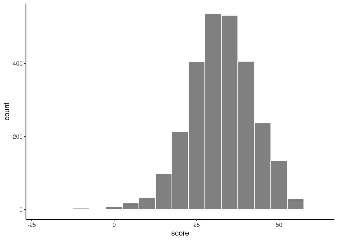
We can treat these 2661 scores as a sample from a broader statistical population of all students in similar higher education institutions when this data was collected. Remember, in inferential statistics our goal is to learn about the population rather than simply describe the sample — so while the sample mean score is 32.4, the population mean is unknown and must be estimated using statistical inference.
Ultimately, in order to perform any inferential statistical analysis of this data, we must assume a statistical model of the data. In other words, we must assume that this data is a sample from some probability distribution (see Note 4.2). But what should this distribution be? Given the characteristics of the histogram shown in Figure 6.1, a statistical model that we could assume, at least as an initial proposal, is that the data are drawn from a normal distribution.
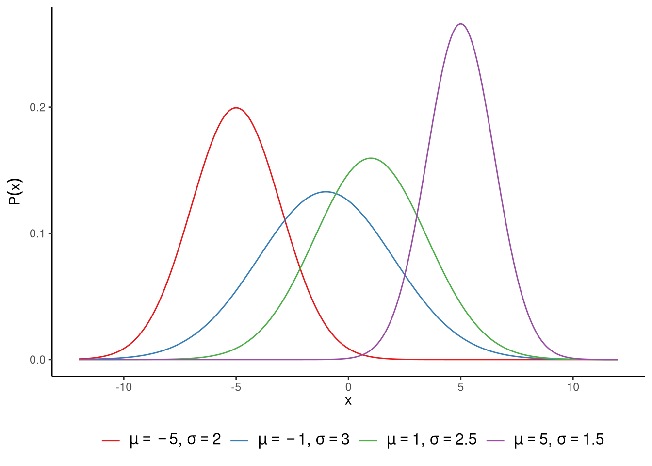
The normal distribution is a smooth function — meaning the curve has no sharp corners or breaks, and the probability changes gradually from one value to the next. It is defined over the real number line, so it can take any possible value from negative infinity (\(-\infty\)) to positive infinity (\(\infty\)). It is symmetrical, so the left and right sides of the curve are mirror images of each other, and unimodal, meaning it has a single peak where most values cluster. Together, these properties give the distribution its characteristic bell shape. Normal distributions are very widely used in statistics (see Note 6.1). In Figure 6.2, we show a set of different normal distributions. The normal distribution has two parameters, which are usually denoted by \(\mu\) and \(\sigma\). The \(\mu\) parameter controls where the centre of the distribution is, while the \(\sigma\) parameter controls its width. We call \(\mu\) the distribution’s location parameter, and \(\sigma\) its scale parameter. More precisely, \(\mu\) tells us what the mean of the distribution is. In fact, it also tells us what the median and the mode of the distribution are too. In any normal distribution, the mean, median, and mode are always identical. As we can see in Figure 6.2, as \(\mu\) increases or decreases, so too does the centre of the distribution. The \(\sigma\) parameter, on the other hand, gives the standard deviation of the distribution. The larger the value of \(\sigma\), the wider the distribution, as we can also see in Figure 6.2. We could equally, and sometimes do, parameterise the normal distribution by \(\sigma^2\). In other words, we define it using its variance instead of its standard deviation. Whether we say the distribution’s scale parameter is \(\sigma\) or \(\sigma^2\) is a matter of choice, and each one is used in different contexts.
The term “normal distribution” can be misleading. In everyday language, normal means typical, but in statistics it refers to a specific bell-shaped probability distribution defined by a precise mathematical formula. Many real-world variables (income, house prices, waiting times, earthquake magnitudes) are not normally distributed.
Moreover, not all bell-shaped distributions are normal distributions. The t-distribution, for instance, is bell-shaped but has heavier tails. When we say data are “normally distributed,” we mean they follow a specific mathematical form, not just “they look bell-shaped.”
Why “normal”? Normal distributions arise naturally when many independent small influences add up. For example, exam scores reflect many factors (ability, sleep, motivation, chance), and their sum tends toward a normal distribution - this is the central limit theorem. This explains why many biological and psychological variables are approximately normal.
Normal distributions are also mathematically tractable, making calculations for standard errors, confidence intervals, and hypothesis tests relatively easy. Statisticians often start with normal models for this reason, even when they’re not a perfect fit.
By assuming this normal distribution statistical model, we are assuming that each one of the 2661 values in our data has been sampled independently from some normal distribution that has some fixed but unknown mean \(\mu\) and some fixed but unknown standard deviation \(\sigma\). Let’s call each individual observed value \(y_i\), where \(i\) labels which observation it is, for example, \(y_1\) is the first student’s score, \(y_2\) is the second, and so on. Given that there are \(n = 2661\) observations, then we can state our model in mathematical notation as follows:
\[ y_i \sim N(\mu, \sigma^2),\quad \text{for $i \in 1 \ldots n$}. \] The notation \(N(\mu, \sigma^2)\) is just conventional statistical notation that is read as a normal distribution with mean \(\mu\) and variance \(\sigma^2\) (or standard deviation of \(\sigma\)). Here, the \(N\) just means “normal distribution”, and it should not be confused with a number such as sample size etc. Note that it is also conventional to write the second parameter as the variance \(\sigma^2\). As we saw in Note 4.4, the \(\sim\) symbol properly means is distributed as but we can also interpret it more simply as is sampled from. The phrase for \(i \in 1 \ldots n\) simply means “for every \(i\) from 1 to \(n\)” — that is, we are making this assumption for each observation in our dataset. Taken together, this means that each \(y_i\) (each individual observation \(y_1, y_2, \ldots, y_n\)) is assumed to be sampled from a normal distribution whose mean is \(\mu\) and whose standard deviation is \(\sigma\).
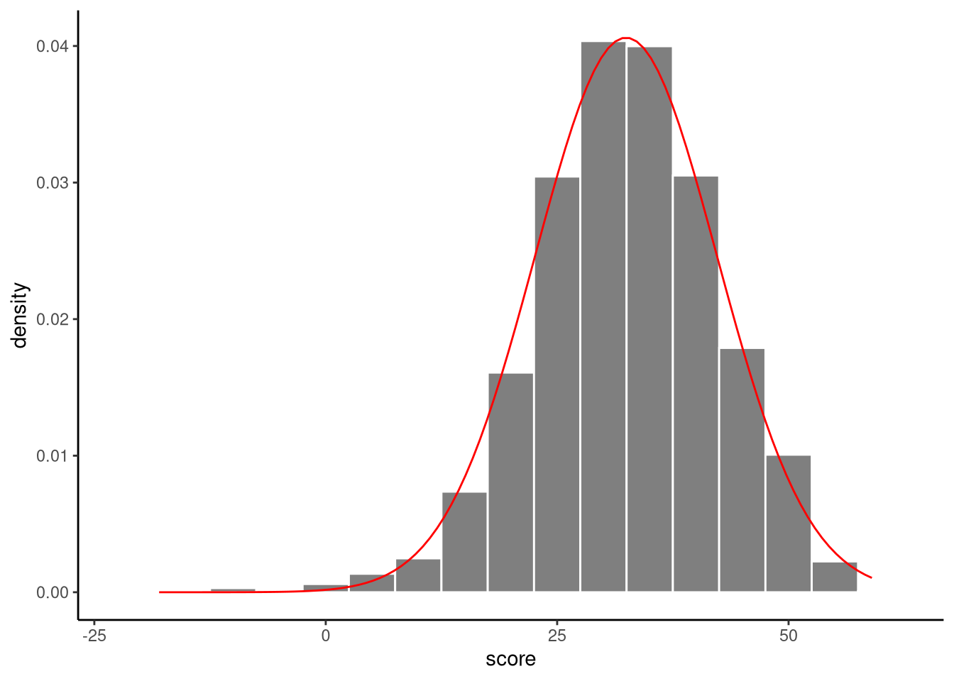
We have assumed that our data are generated by sampling from a normal distribution, but we do not know the values of the mean of the normal distribution \(\mu\) or its standard deviation \(\sigma\). We can, however, estimate what these values are. For example, we can estimate \(\mu\) using the sample mean, which we will denote by \(\bar{y}\), and we can estimate \(\sigma\) using the sample standard deviation, which we will denote by \(s\). By so doing, we say the sample mean and sample standard deviation are estimators of \(\mu\) and \(\sigma\) (see Important 6.1). These were calculated above using the summarise() function: \(\bar{y} = 32.4\), \(s = 9.8\). Using these estimates, we can fit a normal distribution to the histogram of scores, see Figure 6.3.
An estimator is a mathematical formula or procedure that uses sample data to calculate an estimate of an unknown population parameter. For example, the sample mean (\(\bar{y}\)) is an estimator that we use to estimate the population mean (\(\mu\)).
It is important to emphasise that estimates are essentially just guesses, albeit educated ones, of the values of \(\mu\) and \(\sigma\). Because of sampling variation, we cannot know \(\mu\) and \(\sigma\) with certainty. However, as we will now see, we can look at the sampling distribution of the estimators in order to calculate p-values and confidence intervals for \(\mu\) or \(\sigma\).
Our statistical model assumes that the mathematics exam scores are drawn from some normal distribution whose mean \(\mu\) and standard deviation \(\sigma\) are unknown. We can use statistical inference to infer either \(\mu\) or \(\sigma\), or both. Let us just focus on inferring \(\mu\). This method of analysis is usually referred to as the one-sample t-test.
To do this, just as we did inference in Chapter 4, we first work out the sampling distribution of the estimators for different hypothetical values of \(\mu\). A famous result in statistics is the following: \[ \frac{\bar{y} - \mu}{s/\sqrt{n}} \sim \textrm{Student-t}(n-1). \]
Let’s break this down. On the left hand side, we have \(\tfrac{\bar{y} - \mu}{s/\sqrt{n}}\). This is known as the t-statistic. A statistic is a quantity calculated from a sample of data. In the t-statistic, there are four terms: \(\bar{y}\), \(\mu\), \(s\), and \(n\). One of these, \(\mu\), is the hypothesised value of the population mean, while \(\bar{y}\), \(s\), \(n\) are the sample mean, sample standard deviation, and the sample size, respectively. So, for any hypothesised value of \(\mu\) we can calculate the t-statistic by dividing the difference between the sample mean and the hypothesised population mean, \(\bar{y} - \mu\), and dividing by \(s/\sqrt{n}\). The term \(s/\sqrt{n}\) is known as the standard error. In general, the standard error of some estimator is the standard deviation of the sampling distribution of that estimator. It is defined in different ways depending on the context, and plays a major role in classical statistical inference, and we will see it used in all subsequent analyses that we cover in this book.
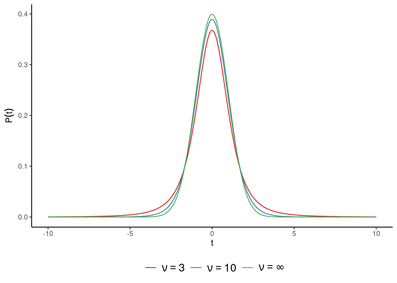
On the right hand side, we have \(\textrm{Student-t}(n-1)\). This is a Student’s t-distribution, or simply a t-distribution, with a parameter whose value is \(n-1\). The parameter of the t-distribution is usually referred to as the degrees of freedom, and is often signified by the symbol \(\nu\). A t-distribution is similar to a standard normal distribution but with heavier tails. The lower the value of the t-distribution’s degrees of freedom parameter \(\nu\), the heavier the tails, and so the more leptokurtic the distribution is. As we discussed in Section 3.5.3.2, a heavy-tailed or leptokurtic distribution puts more mass in the tail of the distribution relative to the mass in the centre. The larger the value of \(\nu\), the more the t-distribution resembles the standard normal, and when \(\nu = \infty\), the t-distribution is identical to the standard normal. In Figure 6.4, we show t-distributions when the degrees of freedom parameter is \(\nu = 3\), \(\nu = 10\), and \(\nu = \infty\).
This sampling distribution therefore tells us that for any hypothetical value of \(\mu\), the sampling distribution of the t-statistic is distributed as a t-distribution with degrees of freedom parameter \(\nu = n-1\). This means that for any hypothetical value of \(\mu\), we can say what values of the t-statistic are, or are not, expected or typical. If, for some hypothetical value of \(\mu\), the value of the t-statistic is relatively extreme, this means that the results are not expected according to, and so are not compatible with, the hypothesised value of \(\mu\).
What values of \(t\) are or are not expected according to the t-distribution depends precisely on the value of the \(\nu\) parameter. However, roughly speaking, most of the mass under the t-distribution is between around \(-2\) and \(2\), and certainly between around \(-3\) and \(3\) (see Note 6.2 for more detail).
The key idea here is that the t-distribution does not describe a new set of data. Instead, it describes how the t-statistic behaves if the population really has mean \(\mu\) and we are estimating its standard deviation from the sample. In other words, the t-distribution is the model we use to reason about how sample means would vary when sampling repeatedly from a normal population with mean \(\mu\). We’re effectively using one distribution (the t-distribution) to work out which values of another parameter (the population mean, \(\mu\), in our normal model) are plausible given our sample.
Use t_auc() and t_interval() from sgsur to work with probabilities in t-distributions.
The t_auc() function calculates area under the curve. For a t-distribution with \(\nu=10\) degrees of freedom, the probability between \(-2\) and \(2\) is:
t_auc(lower_bound = -2, upper_bound = 2, nu = 10)[1] 0.926612The t_interval() function finds the range containing a specified probability mass. For example, the 95% interval with \(\nu=10\):
t_interval(nu = 10, probability = 0.95)[1] -2.228139 2.228139Intervals widen for smaller \(\nu\) (e.g., \(\nu=3\) gives \(\pm 3.18\)) and narrow for larger \(\nu\) (e.g., \(\nu=100\) gives \(\pm 1.98\), close to the standard normal’s \(\pm 1.96\)).
Once we know the sampling distribution of the t-statistics for any hypothesised value of \(\mu\), we can calculate p-values. Let us start with the hypothesis that \(\mu = 32\). We already calculated that the sample mean and sample standard deviation are \(\bar{y} = 32.44\) and \(s = 9.82\), respectively, and that the sample size is \(n = 2661\), and so the value of the t-statistic when \(\mu = 32\) is \[ t = \frac{\bar{y}-\mu}{s/\sqrt{n}} = \frac{32.44 - 32}{9.82/\sqrt{2661}} = 2.3. \]
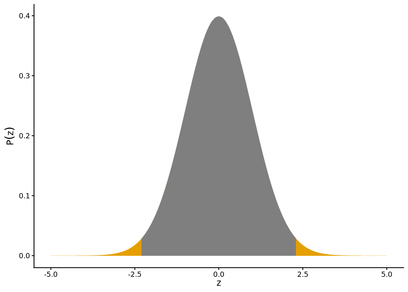
According to the hypothesis that \(\mu = 32\), the t-statistic is distributed as a t-distribution with degrees of freedom \(\nu = 2660\) (2661 - 1). This distribution is shown in Figure 6.5, where the vertical line indicates the observed value of the t-statistic, i.e., \(t = 2.3\), which is relatively far from the centre of the t-distribution. The shaded areas show the area under the curve beyond an absolute value of \(t = 2.3\). This is the p-value for the hypothesis that \(\mu=32\). We can calculate this p-value with normal_inference_pvalue() from sgsur.
normal_inference_pvalue(score, mu = 32, data = mathplacement)[1] 0.02147115Note that we can also use the verbose = TRUE option in normal_inference_pvalue to obtain more detailed information about the hypothesis test:
normal_inference_pvalue(score, mu = 32, data = mathplacement, verbose = TRUE)# A tibble: 1 × 3
t nu p
<dbl> <dbl> <dbl>
1 2.30 2660 0.0215This p-value of approximately \(0.02\) is relatively low. This means that, if the true population mean really were exactly \(\mu = 32\), then obtaining a sample mean as extreme as ours would be quite unlikely. In other words we can conclude that the data have a low degree of compatibility with the hypothesis that \(\mu = 32\).
As discussed in Chapter 4, the range of possible values of \(\mu\) that are compatible — or more accurately, not incompatible — with the data is given by the confidence interval. We could in principle use R to calculate the p-value for a wide range of possible values of \(\mu\), selecting those values where \(p > 0.05\), to find the 95% confidence interval. However, it is possible to do this using a formula instead. This is implemented in the normal_inference_confint() function in sgsur. For example, we can calculate the 95% confidence intervals for \(\mu\) as follows:
normal_inference_confint(score, data = mathplacement, level = 0.95)[1] 32.06477 32.81160From this, we can say that the data are compatible with \(\mu\) having a value anywhere from \(32.06\) to \(32.81\) — values that are slightly higher than the hypothesised mean of exactly 32.
The formula for the \(\gamma\) level confidence interval for \(\mu\), where \(\gamma\) is, for example, \(\gamma=0.95\), is as follows: \[ \bar{y}\pm T(\gamma,\nu)\frac{s}{\sqrt{n}}, \] where \(T(\gamma, \nu)\) gives the value in t-distribution with \(\nu\) degrees of freedom such that the area under the curve within \(\pm T(\gamma, \nu)\) is \(\gamma\).
We can find the values of \(T(\gamma, \nu)\) for any value of \(\gamma\) and \(\nu\) with the t_interval function. For example, if we aim to calculate the \(\gamma = 0.95\) confidence interval for \(\mu\) where the sample size is \(n=25\), then we can find the values between which lie 95% of the area under the curve in a \(n-1=24\) degrees of freedom t-distribution as follows:
t_interval(nu = 24, probability = 0.95)[1] -2.063899 2.063899and so \(T(0.95, 24)\) is 2.06.
t.testEverything that we did so far with the mathematics exam scores can be done with the t.test() function that comes with R. As we will see, this function can be used for other inference in normal models problems too. To infer the value of the population mean \(\mu\), where we hypothesise that \(\mu=32\), we can use t.test() as follows:
t.test(score ~ 1, data = mathplacement, mu = 32)
    One Sample t-test

data:  score
t = 2.301, df = 2660, p-value = 0.02147
alternative hypothesis: true mean is not equal to 32
95 percent confidence interval:
 32.06477 32.81160
sample estimates:
mean of x
 32.43818
From the output, the p-value, confidence interval, t-statistic, and degrees of freedom are identical to what we calculated earlier. Note that we wrote score ~ 1 in this function. This uses a general coding style for specifying statistical models in R that we see repeatedly from now on. For now, we will sidestep exactly what score ~ 1 means, but we will return to it later after we’ve seen uses of the R formula in regression models.
We made the assumption that the mathematics exam scores were normally distributed with little justification beyond the fact that the histogram is roughly unimodal, symmetric, and bell-shaped. We can, however, do more to address whether this assumption of normality is justified.
Normal distributions have some well-defined characteristics. For example, in terms of the area under the curve — which refers to how much of the total probability is contained within a range of values — approximately 95% of the total probability in a normal distribution lies within 1.96 standard deviations from the mean. Likewise, approximately 99% lies within 2.58 standard deviations from the mean. If our mathematics exam scores were normally distributed, we should therefore expect the following: the value at the 2.5th percentile should be around 1.96 standard deviations below the mean, the 97.5th percentile should be around 1.96 standard deviations above the mean, the 0.5th percentile should be around 2.58 standard deviations below the mean, and the 99.5th percentile should be around 2.58 standard deviations above the mean. Let us see if this is the case.
First, we will convert all scores into so-called z-scores, which are obtained by subtracting the mean from each score and dividing by the standard deviation. This can be done as follows using the mutate() function (see Section 5.6):
mathplacement <- mutate(
  mathplacement,
  z = (score - mean(score))/sd(score)
)
A z-score simply tells us how many standard deviations a score is from the mean. If a z-score is \(-1\), it tells us the corresponding score is one standard deviation below the mean. If a z-score is \(2.5\), it tells us the corresponding score is 2.5 standard deviations above the mean, and so on. Now, let us find the z-scores at the 0.5th, 2.5th, 97.5th, and 99.5th percentiles. We can do this using the quantile() in R. First, we extract the newly created z variable from mathplacement using pull() from dplyr. What pull() does is to essentially remove (a copy of) the column from the data frame and return it as a vector. We then pass this to quantile() where we indicate with probs which percentiles we want:
pull(mathplacement, z) |>
  quantile(probs = c(0.005, 0.025, 0.975, 0.995))
0.5% 2.5% 97.5% 99.5%
-3.098495 -1.978735 1.889525 2.296710 With these, we see some departures from what we were expecting. For example, the value at the 0.5th percentile is about 3.1, rather than the expected 2.58, standard deviations from the mean. Likewise, the value at the 99.5th percentile is about 2.3, rather than the expected 2.58, standard deviations from the mean. We also see that the value at the 97.5th percentile is about 1.89, rather than the expected 1.96, standard deviations from the mean. This indicates that values on the lower end are further from the mean, and values on the higher end are closer to the mean than we would expect if this data were normally distributed. This is indicative of a negative or left skew: the tail on the left of the distribution is longer than that on the right.
We can calculate the skewness and kurtosis directly, using the methods introduced in Section 3.5.3.1 and Section 3.5.3.2:
summarise(
  mathplacement,
          skewness = skewness(score),
          kurtosis = kurtosis(score)
)
# A tibble: 1 × 2
skewness kurtosis
<dbl> <dbl>
1 -0.361 3.74We can see that the skewness is negative (left skew), and the kurtosis > 3 (indicating departure from normality) but both are relatively mild by conventional standards.
A more systematic way of investigating whether a distribution conforms to some specified theoretical distribution such as a normal distribution is to use a QQ-plot. QQ-plots are valuable and widely used graphical methods for analysing distributions. They are, however, not immediately intuitive and thus require some attention and thought to properly understand them. The QQ-plot for the mathematics scores is calculated using qqnormplot() from sgsur and is shown in Figure 6.6:
qqnormplot(score, mathplacement)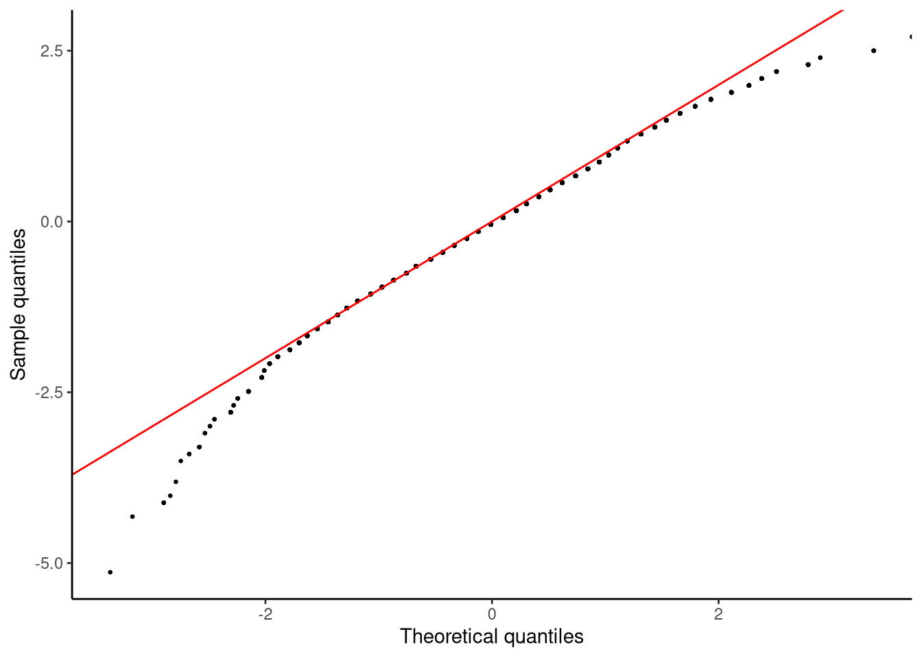
Before we attempt to interpret this plot, let us describe how QQ-plots are calculated. Given a set of values \(y_1, y_2 \ldots y_n\), we first calculate their z-scores. Let us denote these z-scores by \(z^e_1, z^e_2 \ldots z^e_n\), where the superscript stands for empirical which simply means that these values are based on the observed data. For each z-score, we calculate its percentile and then find which value in a standard normal variable has that same percentile. A standard normal variable is simply a normal distribution with mean 0 and standard deviation 1 — it serves as a reference model for theoretical z-scores. For example, let us say that \(z^e_i = 1.5\) is at the 10th percentile, we then find which value is at the 10th percentile in a standard normal variable. Finding the value in a standard normal variable at any given percentile can be found easily with the function qnorm. For example,
qnorm(0.1)[1] -1.281552tells us that -1.28 is the value in a standard normal variable that is at the 10th percentile. These z-scores are the theoretical z-scores, so we represent them as \(z^t_1, z^t_2 \ldots z^t_n\), where the superscript stands for theoretical, meaning they come from the reference model rather than the observed data. The QQ-plot then plots \(z^e_1, z^e_2 \ldots z^e_n\) on the \(y\)-axis against \(z^t_1, z^t_2 \ldots z^t_n\) on the \(x\)-axis. If the empirical z-scores have identical percentile values as the theoretical z-scores, then all the data points should fall perfectly on the identity line (the line with slope of \(1\) and intercept of \(0\)). Wherever points are off this identity line, this indicates some discrepancy between the distribution of the data and the normal distribution.
In Figure 6.6, in the lower left part of the plot, we see a trail of points that are below the identity line. These values correspond to values on the \(y\)-axis that are from around \(-2.5\) to \(-5.0\). Their corresponding values on the \(x\)-axis are from around \(-2\) to around just under \(-3.5\). This shows that values on the left tail of the data are extending further from the mean than we would expect if the data were normally distributed. If, by contrast, we look at the upper right part of the plot, we see another trail of points that are off the identity line. In this case, these correspond to values on the \(y\)-axis that are from around \(2.0\) to \(2.5\), while their corresponding values on the \(x\)-axis go from around \(2.5\) to approximately \(4.0\). This shows that values on the right tail of the data are not extending as far from the mean as we would expect if the data were normally distributed. Together, these indicate a negative or left skew to the data.
In many studies we have paired samples: two measurements from the same person or unit, such as before and after an intervention, or under two matched conditions. For example, students’ maths scores might be recorded before and after a tutoring programme. Survey respondents’ attitudes toward immigration could be measured before and after exposure to a campaign message. Workers’ stress levels might be assessed on a typical week and again after a company introduces flexible hours. In each case we label the first measurement \(y_{i1}\) and the second \(y_{i2}\) for person \(i\). Our analysis then focuses on the differences \[ d_i = y_{i2} - y_{i1}. \] If the set of first and second measurements are roughly normally distributed and a scatterplot of \(y_1\) vs. \(y_2\) shows a straight(ish) cloud of points (i.e., they rise and fall together), then the differences will usually be approximately normal too. Then, we can analyse the differences just as we analysed normally distributed values in Section 6.2. This method of analysis is often referred to as the paired samples t-test.
Let’s look at the mindfulness dataset from sgsur:
# A tibble: 100 × 5
   id    gender pss_before pss_after pss_followup
   <fct> <fct>       <dbl>     <dbl>        <dbl>
 1 1     Male           28        16           20
 2 2     Female         10         6            8
 3 3     Male           26        17           14
 4 4     Male           11         8           12
 5 5     Female         17        14            6
 6 6     Female         26        10            8
 7 7     Female         24        16           16
 8 8     Male           24        15           14
 9 9     Female         21        10            8
10 10    Female         29        16           20
# ℹ 90 more rows
This provides stress scores (measured by the perceived stress scale) before and after a mindfulness training course. In Figure 6.7, we plot the scatterplot of the before (pss_before) and after (pss_after) stress scores with a line that best fits this scatterplot, and also show the histograms for both sets of scores.
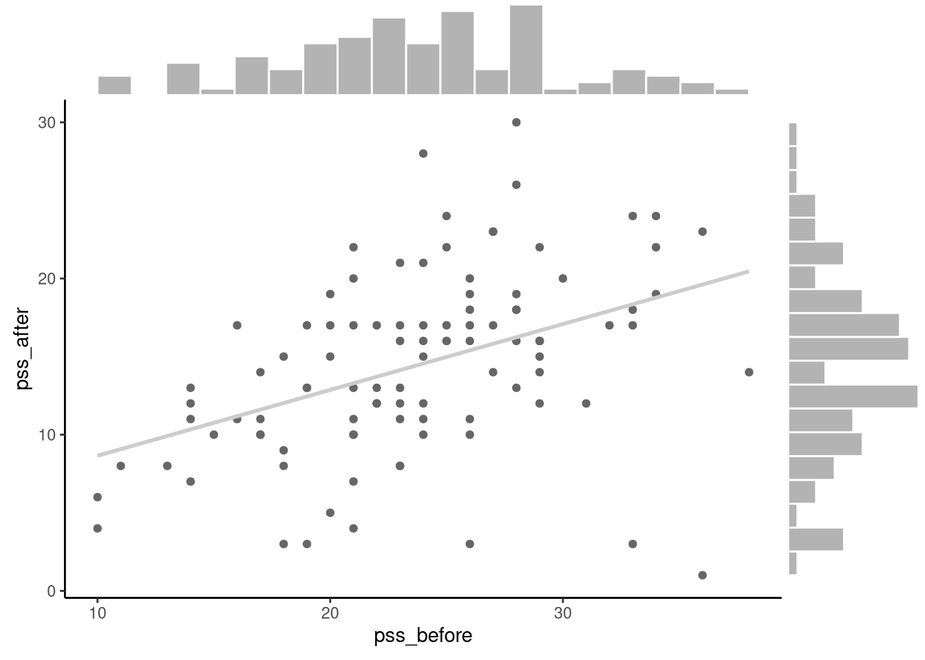
The patterns that we see in this figure imply that the difference scores (pss_after - pss_before) should be roughly normally distributed.
We can use the mutate() function to create a new difference score variable:
# overwrite original mindfulness data frame
mindfulness <- mutate(mindfulness, diff = pss_after - pss_before)
Here, diff records the change in perceived stress from before to after the training: negative values indicate a decrease in stress; positive values indicate an increase.
The mean, standard deviation, skewness, kurtosis, and sample size of diff are as follows:
summarise(mindfulness,
          mean = mean(diff),
          sd = sd(diff),
          skew = skewness(diff),
          kurtosis = kurtosis(diff),
          n = n())
# A tibble: 1 × 5
mean sd skew kurtosis n
<dbl> <dbl> <dbl> <dbl> <int>
1 -9.29 6.32 -0.970 5.47 100The histogram of these difference scores is shown in Figure 6.8:
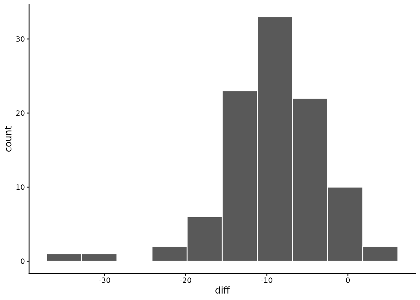
diff = pss_after - pss_before), showing the distribution is roughly bell-shaped and unimodal, centred around a negative value indicating a reduction in stress scores.
From these summary statistics and plots, we see that there is clearly a unimodal and roughly bell-shaped distribution to the diff scores centred around -9. This indicates that on average there is a drop of around -9 points on the stress scale from before to after the training course. These exploratory results, however, make it clear that there is a negative (left) skew and high kurtosis indicating a more platykurtic distribution than a normal distribution. We will return below to the implications of these possible violations of normality below.
As with any inferential statistical analysis, we can treat this sample of difference scores as a sample from a statistical population. As discussed, defining the statistical population precisely — and hence determining who we can generalise to — requires careful consideration. In the mindfulness study, the sample of 100 participants represents a specific subset of adults: those who self-refer to online mindfulness courses for stress reduction. This population consists of individuals who are experiencing sufficient stress to seek intervention, have access to and comfort with online platforms, and are motivated to complete a 6-week training programme. Importantly, this differs from both the general adult population and clinical populations receiving formal stress-related treatment. The inference problem is therefore to estimate the average change in stress scores that would occur in this population of self-motivated adults participating in similar web-based mindfulness interventions.
Our statistical model for this analysis is that each difference score is a sample from a normal distribution with mean \(\Delta\), representing the average change in stress scores in the population, and standard deviation \(\sigma\). The Greek letter \(\Delta\) (pronounced “delta”) is conventionally used to represent a difference or change between quantities — here, it stands for the population mean difference in stress scores. We use \(\Delta\) rather than \(\mu\) because we are modelling a change between two means, not a single mean itself.
In other words, our model is \[ d_i \sim N(\Delta, \sigma^2),\quad \text{for $i \in 1 \ldots n$} \] Both \(\Delta\) and \(\sigma\) are unknown and so need to be inferred from the data. We can do this exactly as we inferred the mean and standard deviation for the mathematics scores.
For any given hypothetical value of \(\Delta\), we can obtain a p-value that tells us how compatible the observed data is with the hypothesis. The (no-effect) null hypothesis in this study is \(\Delta = 0\). This is the hypothesis that on average there is no difference between stress scores before and after the mindfulness training course. We can obtain the p-value for this hypothesis by calculating the t-statistic using the same formula as used above for the mathematics exam scores: \[ t = \frac{\bar{d}-\Delta}{s_d/\sqrt{n}}, \] where \(\bar{d}\) and \(s_d\) are the mean and standard deviation, respectively, of the difference scores. Using the values that we calculated above, this works out as follows: \[ t = \frac{-9.29 - 0}{6.32/\sqrt{100}} = \frac{-9.29}{0.63} = -14.7. \] Note how the t-statistic is just the sample mean of differences, \(-9.29\), divided by the standard error, \(0.63\). The (absolute) value of the t-statistic here is very large: \(t = 14.7\). As noted above, even values greater than 2, and certainly greater than 3, indicate results that are very extreme if the hypothesis is true. In other words, if \(\Delta=0\), with high probability, we should be expecting t-statistics of no more than 2 or 3 in absolute terms. Clearly therefore a t-statistic with an absolute value of \(t = 14.7\) is extremely far from what would be expected were \(\Delta = 0\).
We can obtain the p-value using normal_inference_pvalue() as we did before:
normal_inference_pvalue(diff, mu = 0, data = mindfulness, verbose = TRUE)# A tibble: 1 × 3
t nu p
<dbl> <dbl> <dbl>
1 -14.7 99 1.25e-26The p-value confirms that the observed results are far from what would be expected were \(\Delta = 0\). The p-value is an almost infinitesimal value (about 25 zeros to the right of the decimal point). Clearly therefore, there is almost no evidence in favour of the hypothesis that \(\Delta = 0\).
Having ruled out \(\Delta = 0\), we are still left with the question of what hypothetical values of \(\Delta\) cannot be ruled out. As we’ve discussed, the set of values of \(\Delta\) that are compatible — or not incompatible — with the data is given by the confidence interval:
normal_inference_confint(diff, mindfulness) # 95% CI[1] -10.544071 -8.035929This tells us that the data are compatible with the population average stress reduction score of between around 8 and 11 points.
As noted, the t.test() function that is part of R can be used to obtain all of these results:
t.test(diff ~ 1, data = mindfulness, mu = 0) # test null: Delta = 0
    One Sample t-test

data:  diff
t = -14.699, df = 99, p-value < 2.2e-16
alternative hypothesis: true mean is not equal to 0
95 percent confidence interval:
 -10.544071  -8.035929
sample estimates:
mean of x
    -9.29
In general, we would recommend using t.test() or other tools in R like lm() (see Chapter 7) for doing analyses like those covered here in practice. The tools like normal_inference_pvalue() and normal_inference_confint() are primarily designed for pedagogical purposes.
When we test a null hypothesis like \(\Delta = 0\), we find out whether a pattern could have occurred “by chance,” but that tells us nothing about how large the pattern actually is. An effect size is any numerical summary that answers “How much?” rather than merely “Is it different?” It can be as simple as a raw difference in means. For example, for the mindfulness intervention study, the observed effect can be stated as a -9.29 point reduction on a stress scale. These are sometimes known as “raw” effect sizes, which are generally quantities on the original measurement scale (in this case the perceived stress scale).
Raw units are ideal when everyone understands the scale. In other words, for example, their meaning is clear when everyone understands what a one point, or five point, or ten point difference means. But across studies, disciplines, or measurement tools we often need a common yardstick in order to allow us to compare effects in different units or using different measurement scales. Standardised effect sizes put results on a unit‑free metric, such as multiples of a standard deviation, so we can compare effect sizes in very different contexts.
Cohen (1988) proposed several standardised effect sizes for different types of problems and analysis. For problems related to difference in means, Cohen proposed standardised effect sizes, now known as “Cohen’s d”, that express the mean difference as a multiple of some relevant standard deviation. For example, \(d = 0.5\) means that groups differ on average by half of a standard deviation. Cohen’s d are the most widely reported standardised effect size for mean differences.
Although there is no unanimous or precise interpretation of Cohen’s d values, the following table can be used as rough rules of thumb:
| Cohen’s d | Conventional label |
|---|---|
| < 0.20 | Negligible / trivial |
| 0.20 – 0.49 | Small |
| 0.50 – 0.79 | Medium |
| 0.80 – 1.29 | Large |
| ≥ 1.30 | Very large |
When interpreting Cohen’s d values in this way, we ignore whether the sign is negative or positive.
With paired data, each person provides two scores and so we work with the difference scores \(d_i = y_{2i}-y_{1i}\). Here, \(d_i\) represents each individual’s change, \(\bar{d}\) (read “d-bar”) is the average of these difference scores, and \(s_d\) is their standard deviation.
Cohen’s d for this situation is defined as \[ \text{Cohen's d} = \frac{\bar{d}}{s_d}. \]
For the mindfulness study data, we can calculate this easily using the summarise() function:
summarise(mindfulness, cohen_d = mean(diff)/sd(diff))# A tibble: 1 × 1
cohen_d
<dbl>
1 -1.47As we can see, this is a very large standardised effect size.
It is important to remember that standardised measures such as Cohen’s d are still sample statistics. They are calculated directly from summary statistics and so will naturally vary from sample to sample. In general, we are interested in the population effect size, rather than the sample effect size, and so must infer this using statistical inference tools like p-values and confidence intervals. The 95% confidence interval, for example, gives us the range of population effect sizes that are not incompatible with the observed data. In practice, confidence intervals turn an effect-size point estimate into an evidence statement that conveys not only how big the effect is but also how sure we are about that size.
Using the cohens_d() function from the sgsur package (taken from effectsize package), see Section 2.3.1), we can calculate Cohen’s d and its 95% confidence interval (using the method proposed by Algina et al. (2005)):
summarise(mindfulness,
          cohens_d(pss_after, pss_before, paired = TRUE))
# A tibble: 1 × 4
Cohens_d CI CI_low CI_high
<dbl> <dbl> <dbl> <dbl>
1 -1.47 0.95 -1.75 -1.18In this case, the uncertainty around the population effect size is captured by the 95% confidence interval, which ranges from −1.75 to −1.18. This interval shows that only large population effect sizes are compatible with the data
Before starting a study, researchers often ask simple but crucial planning questions: How many participants do I need? When should I stop collecting data?
A sample size calculation provides the answer. It estimates how large a study must be to give a specified probability of detecting an effect of a given size assuming that such an effect truly exists in the population.
These calculations depend on three key quantities that trade off against each other: - Effect size (e.g., Cohen’s d): smaller effects require larger samples to detect. - Significance level (\(\alpha\)): using a stricter \(\alpha\) (like .01 instead of .05) reduces false positives but also makes detection harder. - Statistical power: the probability of detecting a true population effect of a given size, when it is present (commonly set at 0.8, meaning an 80% chance of detection).
You can explore this relationship with directly in R using the pwr package:
library(pwr)

# How many participants are needed for a paired-samples t-test?
# In this example, we assume:
# - a medium effect size (d = 0.5)
# - 80% power (the probability of detecting the effect if it truly exists)
# - a significance level of .05
# - a two-tailed test (allowing for the possibility that the difference between pairs could be positive or negative, rather than testing only one direction)


pwr.t.test(d = 0.5, power = 0.8, sig.level = 0.05,
           type = "paired", alternative = "two.sided")
     Paired t test power calculation

              n = 33.36713
              d = 0.5
      sig.level = 0.05
          power = 0.8
    alternative = two.sided

NOTE: n is number of *pairs*
The output tells us the number of pairs required – that is, the number of participants who each provide two linked measurements (for example, before and after an intervention). Here, around 33 participants are needed to detect a medium effect (d = 0.5) with 80% power. If the expected effect size halves to d = 0.25, the required sample size roughly quadruples to about 128 participants.
That simple rule of thumb — small effects need big samples — is one of the most useful takeaways from sample size planning.
We saw above that the distribution of difference scores has a moderate to strong left skew and is leptokurtic. This may violate the assumption of normality. In this case, we can consider some alternative methods of inference. One common approach is to use the Wilcoxon signed-rank test to test a null hypothesis about the difference scores. Another, more powerful, approach is to calculate confidence intervals using bootstrapping.
The signed‑rank test calculates the p-values for the hypothesis that the median of the paired differences is some hypothesised value. It does so without assuming any particular shape for the distribution. As such, it is usually referred to as distribution-free or nonparametric. It works by ranking the difference scores from smallest to largest and calculating the sums of the ranks for difference scores that are above or below the hypothesised median difference.
We can test the null hypothesis of a median difference of 0 using the Wilcoxon signed-rank test in R using wilcox.test() as follows, which also calculates the confidence interval on the median difference:
wilcox.test(diff ~ 1, data = mindfulness, mu = 0, conf.int = TRUE)
    Wilcoxon signed rank test with continuity correction

data:  diff
V = 37, p-value < 2.2e-16
alternative hypothesis: true location is not equal to 0
95 percent confidence interval:
 -10.000039  -7.999952
sample estimates:
(pseudo)median
     -8.999957
The test statistic, $V = 37 is the sum of the rank of difference scores above the hypothesised median difference.
Just as we obtained with the paired samples t-test that assumed normality, the p-value for the null hypothesis in the Wilcoxon signed rank test is very low. In addition, the 95% confidence interval for the difference of medians closely corresponds to the 95% confidence intervals for the difference of means in the t-test.
The core insight behind bootstrapping is treating your sample as a miniature version of the true population. By repeatedly resampling from your original data, you can simulate what would happen if you could collect many samples from the same population.
The process works by creating new samples of identical size to your original data, but sampling with replacement. This means some observations will appear multiple times in a resample while others won’t appear at all. For each resample, you calculate the same statistic you’re interested in. After repeating this process thousands of times, you’ve created a bootstrap distribution that reveals how much your statistic would vary across different samples.
This bootstrap distribution directly provides measures of uncertainty. The central 95% of values gives you a confidence interval, while the spread (e.g., standard deviation) of the distribution estimates the standard error of your statistic.
The key advantage is that bootstrapping relies entirely on your actual data rather than mathematical formulas that assume specific conditions like normality or equal variances. This makes it particularly valuable for complex statistics or when traditional assumptions don’t hold. Modern computing power has made this resampling approach both practical and fast, often completing thousands of iterations in less than a second.
Bootstrapping treats your observed sample as a miniature population and repeatedly resamples to approximate the sampling distribution of any statistic (see Note 6.5).
To calculate the bootstrap confidence interval for the mean difference, we do the following:
This can be done in a pipeline (see Section 2.6.4 and Section 5.10) using the infer package, which will be installed if you installed all packages using sgsur::install_extras():
library(infer)

mindfulness |>
  specify(response = diff) |>                      # tell infer the variable
  generate(reps = 10000, type = "bootstrap") |>    # 10k paired resamples
  calculate(stat = "mean") |>                      # calculate statistic of interest
  get_ci(level = 0.95, type = "percentile")        # 95% percentile CI
# A tibble: 1 × 2
lower_ci upper_ci
<dbl> <dbl>
1 -10.5 -8.11Although the bootstrapping confidence interval makes no assumption about the population’s distribution, the 95% bootstrap confidence interval closely matches that calculated by the paired samples t-test.
Research questions often involve comparing two distinct groups: younger versus older adults, online versus in-person classrooms, or urban versus rural hospitals. Unlike the paired samples we examined earlier — where measurements came from the same units (before/after, left/right, twin pairs) — these groups are independent. Knowing the values in one group tells us nothing about the values in the other. This independence changes our analytical approach. Instead of examining differences within matched pairs, we must compare the groups while accounting for variation that exists both within each group and between them.
As a concrete example, consider the data from the 2022 UK wave of the Programme for International Student Assessment (PISA). This data is available in the pisa2022uk dataset that is part of sgsur:
pisa2022uk# A tibble: 12,972 × 4
math read science gender
<dbl> <dbl> <dbl> <fct>
1 700. 651. 661. male
2 454. 482. 461. male
3 566. 520. 620. male
4 372. 320. 287. female
5 424. 350. 386. male
6 393. 366. 324. male
7 446. 468. 516. male
8 373. 416. 356. male
9 613. 641. 630. female
10 451. 330. 572. male
# ℹ 12,962 more rowsThe study tested the mathematics, reading, and science proficiency of 12972 fifteen‑year‑olds; 6575 boys and 6397 girls.
Focusing on the reading scores, let us visualise these scores using boxplots (see Figure 6.9) and look at the descriptive statistics:
summarise(pisa2022uk,
          mean = mean(read),
          sd = sd(read),
          skew = skewness(read),
          kurtosis = kurtosis(read),
          n = n(),
          .by = gender)
# A tibble: 2 × 6
gender mean sd skew kurtosis n
<fct> <dbl> <dbl> <dbl> <dbl> <int>
1 male 482. 107. -0.142 2.82 6575
2 female 500. 102. -0.0215 3.02 6397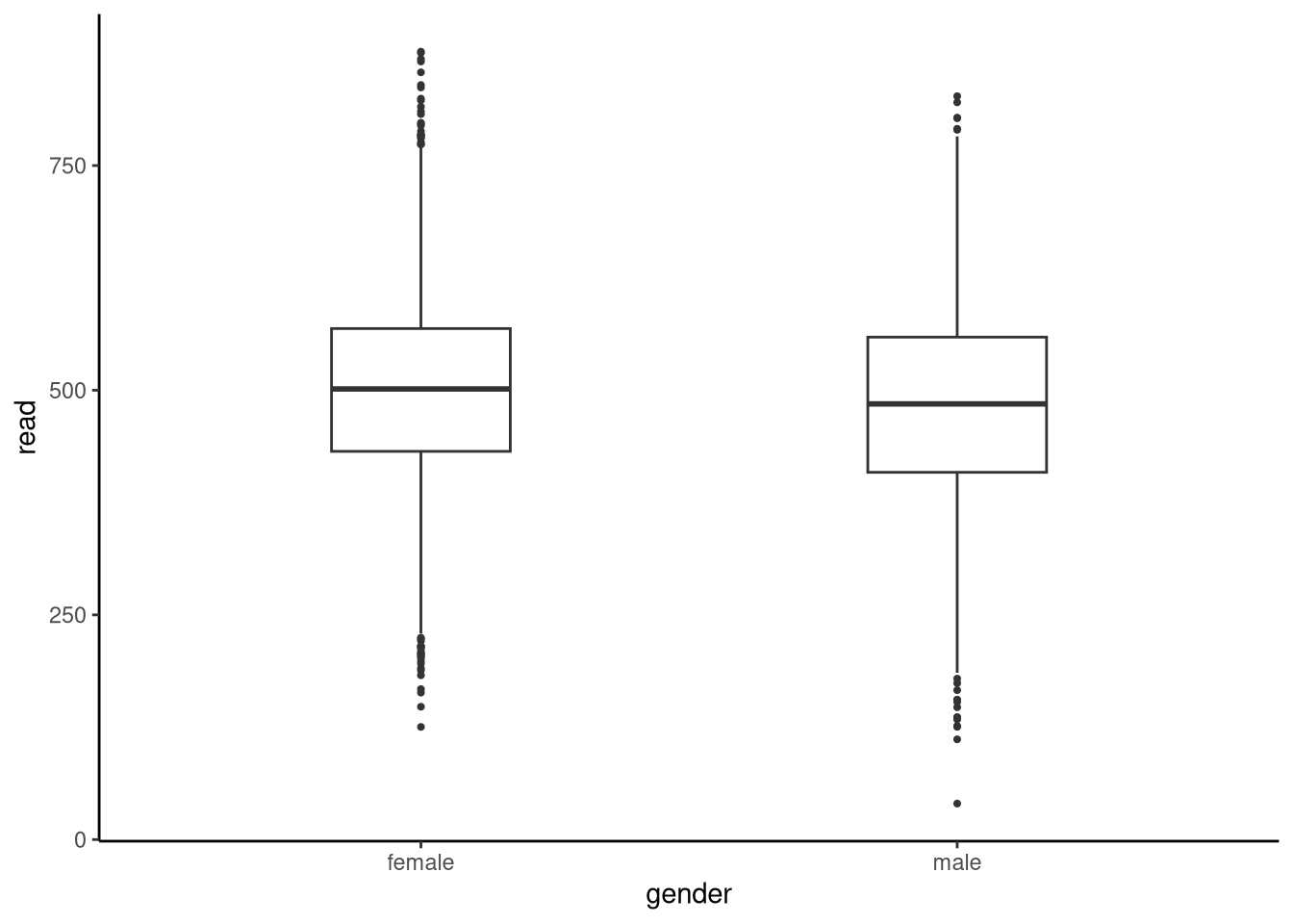
The descriptive statistics suggest girls out‑perform boys by about 19 points. Is this difference large enough, relative to the natural spread of scores, that we can conclude that the population (all 15-year-olds in the UK in 2022) means differ? More generally, by how much do the population means of males and females differ? To address this question systematically, we begin the analysis by making assumptions. One common assumption is that data from both groups are sampled from two different normal distributions whose means are unknown. We then use statistical inference to determine what is the difference in these means. This is often referred to as an independent samples t-test.
If we denote the two groups by \(x_1, x_2 \ldots x_{n_x}\) and \(y_1, y_2 \ldots y_{n_y}\), where \(n_x\) is the sample size in one group and \(n_y\) is the sample size of the other group, the statistical model inherent in the independent samples t-test is that \[x_i \sim \textrm{N}(\mu_x,\sigma^2),\quad \text{for $i \in \{1\ldots n_x\}$},\] and \[y_i \sim \textrm{N}(\mu_y,\sigma^2),\quad \text{for $i \in \{1\ldots n_y\}$},\] where \(\mu_x\), \(\mu_y\) represent the unknown population means for each group, while \(\sigma\) is an unknown standard deviation parameter \(\sigma\) that is shared by both groups. In other words, it is assumed that the two normal distributions have identical standard deviations. This is known as a homogeneity of variance assumption, and it is very commonly made in different contexts in statistics. We will see, however, that we can perform inference without making this assumption.
Having specified the statistical model, our specific interest is to infer the difference between \(\mu_x\) and \(\mu_y\), which can be written as \(\Delta = \mu_x - \mu_y\). As usual, we accomplish this inference through the use of hypothesis testing and confidence intervals, both of which rely on understanding the sampling distribution of the difference between sample means.
The key theoretical result that enables our inference is the following: if \(x\) and \(y\) are samples from normal distributions with means \(\mu_x\) and \(\mu_y\), then the standardised difference between sample means — that is, the observed difference divided by its standard error — follows a t-distribution.
We encountered the t-statistic and t-distribution earlier when working with one-sample and paired designs. Although the formula that follows looks more complex, it represents the same underlying idea: comparing an observed difference between means to what we would expect under the model of equal population means.
\[ \frac{(\bar{x}-\bar{y}) -\Delta}{S_{p}\sqrt{\frac{1}{n_x} + \frac{1}{n_y}}} \sim \textrm{Student-t}(n_{x}\!+\!n_{y}\!-\!2), \] where \(\textrm{Student-t}(n_{x}\!+\!n_{y}\!-\!2)\) represents a t-distribution with \(n_{x}\!+\!n_{y}\!-\!2\) degrees of freedom. The denominator of the t-statistic is the standard error: \(S_{p}\sqrt{\frac{1}{n_x} + \frac{1}{n_y}}\). A key term there is \(S_{p}\), which is the so-called pooled standard deviation defined by \[S_{p} = \sqrt{ \frac{(n_x-1)s^2_x + (n_y-1)s^2_y}{n_x + n_y - 2} }.\] While this may seem complex, it is just the square root of the weighted average of the sample variances, \(s^2_x\) and \(s^2_y\), of the two groups.
We use this sampling distribution as the foundation for constructing hypothesis tests and confidence intervals for the difference between population means. For example, for any hypothesised difference of the population means, \(\Delta = \mu_x - \mu_y\), we can calculate the t-statistic \[ \frac{(\bar{x}-\bar{y}) -\Delta}{S_{p}\sqrt{\frac{1}{n_x} + \frac{1}{n_y}}} \] using just the sample means, sample standard deviations, and sample sizes. The sampling distribution tells us that if the hypothesised value of \(\Delta\) were the true population difference value, then we would expect values according to a t-distribution with \(n_x + n_y - 2\) degrees of freedom. We can therefore calculate the probability of obtaining a value as or more extreme than the t-statistic we obtained if the hypothesised value of \(\Delta\) were true. This probability is the p-value. Overall then, the logic of inference used here in the case of two independent samples is identical to that used already in the previous examples in this chapter.
We can calculate the null hypothesis that \(\Delta = 0\), and obtain other results, using the t.test() function. The following code does this, with mu = 0 indicating the hypothesis that \(\Delta = 0\), while enforcing the homogeneity of variance assumption with var.equal = TRUE:
t.test(read ~ gender, mu = 0, data = pisa2022uk, var.equal = TRUE)
    Two Sample t-test

data:  read by gender
t = 10.152, df = 12970, p-value < 2.2e-16
alternative hypothesis: true difference in means between group female and group male is not equal to 0
95 percent confidence interval:
 15.03052 22.22380
sample estimates:
mean in group female   mean in group male
            500.2030             481.5759
Note that the first argument is read ~ gender. This is a typical regression-like R formula. On the left-hand side of ~, we have the dependent variable (or outcome variable), and on the right, we have the independent variable (or predictor, or explanatory, variable). We will see this R formula very frequently from now on.
In the output, we see a very large t-statistic of 10.2. For reasons discussed, this result is extremely unlikely in any t-distribution. Exactly how unlikely is based on the degrees of freedom, which is the total sample size minus 2: 12972 - 2 = 12970, but even with low degrees of freedom, values much greater than 3 in absolute terms are highly improbable. This indicates that the observed t-statistic is far into the tails of the t-distribution and so the p-value will be extremely low, which is confirmed by the output (p-value < 2.2e-16).
Having ruled out the hypothesis that \(\Delta = 0\), we still do not know which hypothetical values are compatible with the data, and this is given by the 95% confidence interval: 15.03, 22.22. In other words, the data in this sample are compatible with a population mean difference of between 15.03 and 22.22.
The raw effect size for the difference between males and females in the UK PISA 2022 data is that females score on average 18.6 points higher than males. To convert that to a standardised effect size, the most common procedure is to calculate Cohen’s d. \[ \text{Cohen's d} = \frac{\bar{x}-\bar{y}}{S_{p}}, \] where \(S_p\) is the pooled standard deviation. Given the similarity between this formula and the formula for the t-statistic when testing the null hypothesis \(\Delta = 0\), we have: \[ \text{Cohen's d} = t \times \sqrt{\frac{1}{n_x} + \frac{1}{n_y}}, \] where \(t\) is the null hypothesis t-statistic, which in this analysis is 10.15.
We can calculate Cohen’s d from the cohens_d() function in the effectsize package, which also provides the 95% confidence interval:
summarise(
  pisa2022uk, cohens_d(read ~ gender)
)
# A tibble: 1 × 4
Cohens_d CI CI_low CI_high
<dbl> <dbl> <dbl> <dbl>
1 0.178 0.95 0.144 0.213By the usual interpretation of standardised effect sizes, this would be regarded as a small, or even negligible, effect size. That should not necessarily be taken to mean that the difference between reading scores of males and females is of no practical consequence, but it does emphasise again how an extremely low p-value does not mean that the corresponding effect is large.
Cohen’s d is slightly biased upward in small samples. Hedges (Hedges, 1981) proposed multiplying d by a correction factor to correct for this bias. The result is usually known as Hedges’ g. We can obtain this either by doing adjust = TRUE when calling cohens_d() or else using hedges_g() (also from the effectsize package via sgsur):
summarise(
  pisa2022uk, hedges_g(read ~ gender)
)
# A tibble: 1 × 4
Hedges_g CI CI_low CI_high
<dbl> <dbl> <dbl> <dbl>
1 0.178 0.95 0.144 0.213In this case, because the sample size is large, the correction applied by Hedges’ g returns an almost identical result to Cohen’s d.
Our statistical model relies on several key assumptions about the reading score data. We assume that reading scores for both males and females follow normal distributions with equal variances. Additionally, we assume that all individual scores are independent of one another. Independence means that one person’s reading score is not influenced by or correlated with anyone else’s score. This assumption could be violated if students in our sample attended the same schools and received similar quality reading instruction. Such clustering effects can be addressed using more advanced techniques covered in later chapters like Chapter 10 and Chapter 11. However, without additional information about students’ educational backgrounds, we cannot apply those methods to this dataset, and so must accept this assumption for now. For the assumption of normality and homogeneity, on the other hand, we have various options to assess their validity.
For the normality assumption, we can look at the skewness and kurtosis values calculated above, and use QQ plots as shown in Figure 6.10.
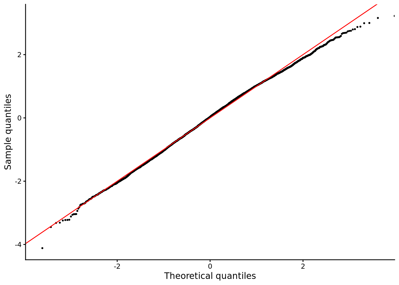
The skewness values are relatively close to zero, and kurtosis values are relatively close to 3.0 for both groups. The QQ plot shows that the distribution of scatter of points are very close to the diagonal line, and this pattern holds for both gender groups. Overall, these results indicate no strong or clear departure from normality.
To assess homogeneity of variance, it is common to use Levene’s test, which tests the null hypothesis that two or more groups have equal variance. A low p-value means the null hypothesis can be rejected, in which case we can assume that the variances are different. This test can be done using the leveneTest() function in sgsur (originally from the car package):
leveneTest(read ~ gender, data = pisa2022uk)Levene's Test for Homogeneity of Variance (center = median)
Df F value Pr(>F)
group 1 27.132 1.93e-07 ***
12970
---
Signif. codes: 0 '***' 0.001 '**' 0.01 '*' 0.05 '.' 0.1 ' ' 1Here, the p-value is very low indicating departure from homogeneity of variance. However, just because this p-value is very low, it does not mean that the variances of the two groups are very different. As with any p-value, very large sample sizes will entail that even almost trivial differences in the standard deviations of the two groups can lead to very low p-values.
When homogeneity of variance cannot be assumed, an easy alternative is to use Welch’s t-test. To do this, we simply write var.equal = FALSE, or leave out the var.equal argument as its default value is false, when we use t.test():
t.test(read ~ gender, mu = 0, data = pisa2022uk)
    Welch Two Sample t-test

data:  read by gender
t = 10.159, df = 12960, p-value < 2.2e-16
alternative hypothesis: true difference in means between group female and group male is not equal to 0
95 percent confidence interval:
 15.03322 22.22110
sample estimates:
mean in group female   mean in group male
            500.2030             481.5759
Unlike the standard independent samples t-test, the Welch’s t-test uses a slightly different standard error term in the t-statistic but more importantly, it has a different degrees of freedom based on something termed the Welch-Satterthwaite equation. You will notice how both the t-statistic and degree of freedom in the Welch’s t-test, 10.159 and 12960, respectively, differ from those of the standard t-test, 10.152 and 12970. However, in this case, these differences are of almost no practical consequence. In both cases, for example, the confidence intervals are almost identical.
For violations of normality, the distribution-free or nonparametric variant of the independent samples t-test is known as the Mann-Whitney test, also known as the Wilcoxon rank-sum test (not to be confused with the Wilcoxon signed-rank test used in Section 6.4.2.1 for paired samples). It compares two independent samples by ranking all observations together and asking whether values from one group tend to occupy higher (or lower) ranks than those from the other. The (no-effect) null hypothesis is that there is an equal probability that a randomly selected value from one group is above or below a randomly selected result from the other group.
We can perform the null hypothesis Mann-Whitney test in R using the wilcox.test() function, also used for the Wilcoxon signed-rank test, as follows:
# aka Mann-Whitney test
wilcox.test(read ~ gender, mu = 0, data = pisa2022uk, conf.int = TRUE)
    Wilcoxon rank sum test with continuity correction

data:  read by gender
W = 22977552, p-value < 2.2e-16
alternative hypothesis: true location shift is not equal to 0
95 percent confidence interval:
 13.59000 21.01197
sample estimates:
difference in location
              17.29697
The W test statistic is the Mann-Whitney U statistic for the first group (females), calculated as the sum of the ranks of the female scores minus \(n_y(n_y+1)/2)\) where \(n_y\) is the sample size of the females.
The p-value is extremely low, as was the case for both the independent samples and Welch’s t-test null hypotheses. More useful is the confidence interval, obtained when we use conf.int = TRUE. This provides the confidence interval of the Hodges–Lehmann location‑shift estimate, which is the median of all pairwise differences between the two groups.
An alternative to the Mann-Whitney test is to calculate the 95% bootstrap confidence interval on the difference of means (or medians, etc). This can be done with a pipeline using tools from the infer package, as was done in Section 6.4.2.2:
pisa2022uk |>
  specify(read ~ gender)  |>                       # tell infer the variable
  generate(reps = 10000, type = "bootstrap") |>    # 10k paired resamples
  # calculate statistic of interest
  calculate(stat = "diff in means", order = c("female", "male")) |>
  get_ci(level = 0.95, type = "percentile")        # 95% percentile CI
# A tibble: 1 × 2
lower_ci upper_ci
<dbl> <dbl>
1 15.1 22.2Although the bootstrapping confidence interval makes no assumption about the population’s distribution, the 95% bootstrap confidence interval closely matches that calculated by the independent samples and Welch t-tests.
Joan Fisher Box’s “Gosset, Fisher, and the t Distribution” (Box, 1981) published in The American Statistician traces how practical brewing problems at Guinness led to the development of the t-distribution through Gosset and Fisher’s collaboration.
Daniel Lakens’ “Sample Size Justification” (Lakens, 2022) published in Collabra: Psychology explains how to plan studies large enough to detect real effects without wasting resources, covering the critical role of sample size in research design.